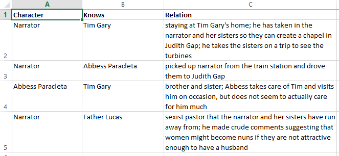
This week we learned to play around with Google Fusion Table to create network diagrams for short stories. I chose to map out a character edge list from “Turbines” by Claire Luchette in the following excel table:
This data was then turned into this (via Google Fusion Tables):
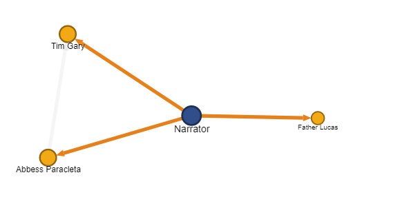
You can check out the interactive version here!
The story itself only features four characters, or nodes, which presumably didn’t make for a very interesting diagram. I did, however, play around with some of the additional features and found this nifty arrow tool (as shown above) which makes it clear the relation of “who knows who.” Additionally, through the different sizes and weights of the fonts and nodes, you can tell who has the most connections as well as who has the least, although this might be more difficult to discern with bigger datasets.
Overall, playing around with the network graph function showed the immense possibilities that Google Fusion Tables provides. Really excited to see how this can add to our final data project!
Hi there,
I like the screenshot of the excel sheet your posted that includes the relationship of the characters, this has highlighted how much the graph fails to depict the relationships between the characters. I think the graph is actually really useful when we try to analyze a bigger network since we will be able to detect more interesting patterns in a larger data set.
Hi! Thank you for screenshotting your excel table- now it makes more sense how these tables work to begin with! The story I chose was relatively short with very straight-forward relationships. It’s cool to see a chart like this that shows more relationships rather than from one central node!