Hellllllo everyone!
For my blog post this week I picked Given by Jesmyn Ward. Given is a story about a black football player who was killed by a white boy while hunting. While reading it, I had a hard time keeping up with who was who’s uncle versus dad versus the sheriff and so on. Therefore, it ended up being the perfect story for a network graph as it laid out clearly everyone’s connection to one another.
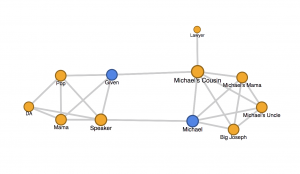
As you can see above, there were two sides of the story – those related to Given and those related to Michael. One could also see it as the innocent vs. the wicked.
However, the graph is misleading because it seems as though the two main characters would be Michael and Given. Though Given is the protagonist, it is Michael’s cousin, not Michael, who ends up being the antagonist. This is a perfect illustration of the limitations of the graph, as it can paint a different picture than that which the author was aiming to portray.
Overall, I found the network graph to be a very cool for of analysis.
Helllloo Bella,
Thanks for sharing your blog post! It’s so cool the network graph was actually helpful for your understanding of the story, that’s awesome to hear. All the different characters sounds very confusing, but your graph maps out the relationships really well.
Thanks, Jacey! Your words are kind.
I like how you used some of the different attributes we discussed in class when talking about data visualizations including spacing and color to make it clearer to the viewer about the relationships involved in the story! Your network graph makes me think about attributes that could have been added to my own network graph! Great blog post!