This week, I examined the data set on Death Rates. I explored many data sets on the website and found that this data set was already easy to read in an excel sheet, so I wanted to see how a data visualization could enhance the interpretation of this information.
This data set listed all 50 states plus the District of Columbia with information regarding deaths based on various causes such as cancer, stroke, suicide, homicide, and many more. What I found a bit confusing about this data set is that there were no units for the data points. I am not sure if the numbers listed are the total deaths per state, the percent of the population who died, etc.

For this blog post, I focused on suicide deaths. Using Google Fusion Tables, I created a bar chart with States on the x-axis and Suicide Deaths on the y-axis. States with the highest suicide deaths include Alaska, Montana, Nebraska, and New Mexico. I tried to think about if those states had anything in common that caused them to have the highest suicide deaths, but I wasn’t able to find any obvious similarities. States with the lowest suicide deaths include D.C., New York, Massachusetts, and New Jersey. These states are all located in Northeastern United States, but I’m not sure how that might relate to lower suicide deaths.
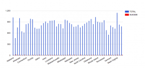
I also created another bar graph that compared the Total deaths to Suicide deaths. Suicide in the states Alaska, Montana, Nebraska, and New Mexico had the highest amount of suicide deaths, but when compared to the total, it was not the largest cause of death which can be easily judged by the size of the red bar compared to the blue.
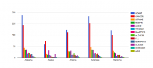
Creating another bar graph with all causes of death provided in the data set, we can clearly see that heart failures and cancer are the leading causes of death in the states.
The data set would be more helpful if there was also related information such as age and income to determine any large factors contributing to deaths. It would also be helpful to know what year this data was gathered, because it may be outdated by now. The data set in the excel sheet was easy to read and the visualizations gave me another perspective to analyze the data, but it would be more effective if the data set was more complete with units and other related information.
I really enjoyed how you provided two graphs to further support the visualization of the dataset! It’s amazing to see how the highest number of deaths in so many states is attributed to either cancer or heart problems. It would indeed be extremely interesting to find out what other factors surround such a high rate of death.