The narrative that I read for this week blog’s post was The Martians Claim Canada. This narrative was a short story about three martians trying to get to New York in order to watch a musical. These martians end up landing in Canada and asking a mushroom for help.
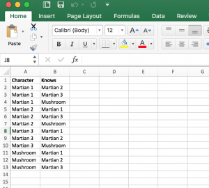 I was initially a bit confused when it came to creating this chart but I was able to understand after a few tries. At first I just made a column for characters but I couldn’t get the system to work. Afterwards I created another column that included who the characters knew and from there I was able to create this chart. I thought that it was pretty cool that Google Fusions was able to read the data from the excel sheet and input it into the system where it would create connections.
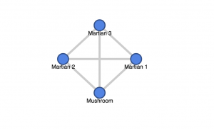 There were only three characters that were presented within this story. The martians all came together and encountered the mushroom in Canada and that’s where they all met. In so in this chart, all the characters are connected to one another because they all interact and converse together within the story. This image seems very plain but personally for me knowing that there were 12 different rows and 24 different data points that went into making this chart, it’s pretty interesting/ cool for me to see.
With that I think one limitation would probably be information regarding relationship title. The martians all came together and it’s clear that they’re pretty close (after all they came to watch a musical together). In this story the mushroom is the odd ball out, but this chart does not show that to us.
Hey there,
I did my blog post on the same short story and organized the connections the same way. It just seemed simple to organize it in this way. I agree with you on the limitation for the chart and how relationships cannot be shown.