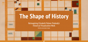
“The Shape of History” is a Digital Humanities project created by Lauren Klein from Georgia Tech Digital Humanities Lab. The project aims to create a reimagined, digitized, and interactive form of Elizabeth Palmer Peabody’s historical visualization system designed in 1856 that translates historical events into visual presentations of shapes and colors. Peabody’s goal and vision was to appeal to the “mind’s eye” and to prompt students and readers (of the images) to develop unique and individual interpretations of history.
Sources:
The “Further Readings” section lists the sources used to understand Peabody’s system, which include Bruce Rhonda’s Elizabeth Palmer Peabody: A Reformer on Her Own Terms, Daniel Rosenberg and Anthony Garfton’s Cartographies of Time: A History of the Timeline, and Peabody’s original textbook, A Chronological History of the United States. The section also includes many links to the researcher’s blog and additional writings on Elizabeth Peabody. Klein is inferred to have obtained historical event information from online databases.
Processing:
Processing data may include organizing, editing, correcting, querying, digitizing, enhancing, etc. This project digitizes Peabody’s system of translating historical events to grid images of shapes and colors. The “Explore” section organizes historical events by century, year, type of event, and countries involved, which determine where each event is presented on a grid and its color. Under the “Play” section, users are able to add their own events to a grid and customize the colors allowing users to create their own image and narrative of a historical timeline, demonstrating the original objective of Peabody. The project organizes, edits, and digitizes data to creative an interactive interface to simulate Peabody’s system of historical visualization.

Presentation:
“The Shape of History” is presented in an interactive website built using HTML5, CSS, and JavaScript, and open-source libraries, such as jQuery, Bootstrap, D3.js and two.js. The layout of the website itself is very interactive and resembles a grid format (like Peabody’s method) which allows users to navigate through from one square to another to go to new pages. Data is visualized through the grid images of organized historical events. The “Compare” page further offers users a visual comparison between the grid visualization of historical events to a tradition timeline.

Overall, I think this was a very fun project that effectively revitalizes Peabody’s historical visualization method. It allows students and users, especially those who learn through more visual experiences, to learn historical events in a less conventional, but possibly more effective way (in certain cases). Peabody’s method created back in the 19th century was originally meant to be interactive, but with the abilities of data processing and digital technology today, “The Shape of History” project further enhances this intent by providing a web-accessible and more interactive experience for users.
Hi –
I agree with you, this is an awesome DH project. I especially agree with what you said about learning history from a visual and interactive method being more effective. I think that there is a lot to be learned from this project that could potentially be applied to means of education for the student growing up in the digital age. In the way that The Shape of History allows users to move through squares interactively to navigate onto new pages, using grid images and comparative features, I’m reminded of some of my most successful studying done in the field of History (among others) on sites like Quizlet, where I was able to organize my notecards in a digitized and neat fashion to learn in a more effective manner. I hope that things like this DH project can be adapted to education for young people – who have grown up entirely in the digital age – to entice them to stay interested in different subjects! Great job!
Thank you for sharing this project with us, Michelle! I really enjoyed how you broke down the “processing” section very clearly. I also enjoyed how you effectively described the different data visualization tools used. Overall, I think The Shape of History is a very interesting project that successfully enhances the visualization of history in an innovative and interactive manner!
Hi Michelle! Thank you for sharing this project with us! I really enjoyed how you explained the different processing and data visualization tools used in The Shape of Us. I definitely agree with you that the project enhances the visualization of history through the use of interactive media!
I appreciate the introduction to your project as being informative as to the significance of the research and sources presented in the original DH project. Also, I agree with you that the project was particularly interesting and I learned quite a bit about the historical visualization method. I also agree about the level of interactivity of the project which contributes to the overall experience of looking through the site.