
The Shape of History: Remaining Elizabeth Palmer Peabody’s Historical Visualization Work is a website design to help people understand the Elizabeth Palmer Peabody’s grid chart and use this method to create their own history grids. The creators of the website use modern technologies to make the tutorial of Peabody’s chart to demonstrate the grid chart step by step, and all viewer will be able to create their historical grid chart eventually.
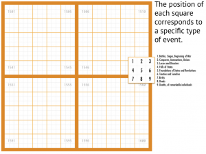
Elizabeth Palmer Peabody, the nineteenth-century writer, editor, and educator, who had come up with a method to translate historical events into a grid chart which abled her student to clearly visualize and easily memorize these events. Instead of a general timeline, Elizabeth chose to use grid chart that each grid in a grid chart means one year, and one grid chart represents one century. There are 9 small grids in each one-year based grid with different event keys, and different colors of events mean different countries.


Sources:
The creators used following resources to learn about Elizabeth Palmer Peabody’s grid chart idea, and they did the comparison with other methods of recording historical events as well.
Bruce Rhonda’s Elizabeth Palmer Peabody: A Reformer on Her Own Terms (Harvard University Press, 1999)–thorough biography of the subject
Daniel Rosenberg and Anthony Grafton’s Cartographies of Time: A History of the Timeline (Princeton Architectural Press, 2010)–the range of visual representations of history
Elizabeth Palmer Peabody’s A Chronological History of the United States (1856)–Peabody’s original textbook.
Processes:
As mentioned on the website, “The Shape of History” was created by using HTML5, CSS, and JavaScript, and also made use of jQuery, Bootstrap, D3.js, and two.js from several open-source libraries. These tools helped creators import and combine the data objects, and make connections among related objects, text, and grid charts.
Presentations:
On this interesting website, there are arrows direct you to the next page include Learn, Explore, Compare, How it works and Play, etc. In the Learn session, you will see every historical event links to one title, one color, and one small grid in the grid chart. They also have the comparison between historical timeline and Peabody’s grid chart. After showing you how the grid chart works, the next page will give you a chance to create your own historical grid chart!


I find this project very interesting in light of the discussion we had in lecture on Monday! I have never seen history plotted as much more than a straight linear line, so this 2D representation illustrates a more complex idea of history. However, this project only chose 9 types of historical events to represent. Historical events such as inventions and innovations are not represented, which touches on the point about silence in history.
This was such an interesting read! The bolded words really helped emphasizing those important points and the images further explained your analysis. This whole post was really easy to follow and made me realize that I overlooked somethings when I visited the site myself. On a side note, how did you personally feel about this project? I know we were only asked to reverse engineer, but I’m just curious about your opinions too lol.
After taking a look at all DH projects provided, this is the one my favorite. The first thing has impressed me is the color which is light, enthusiastic, and warm. The website is designed organized, concise, and LOGIC. (allow viewers efficiently gather all the information in a short time and use the idea) Instead of using a long paragraph to demonstrate the Peabody’s grid chart history, the project uses pictures company with short and simple contents to make it easier to understand. (even person who is not very good at English can understand, so it really makes this idea and method spread out more) In the end, viewers can create their own historical grid chart (historical tool in real practice nowadays) which make it beneficial not only in the past but also impact the present. Overall, I feel this well-developed project facilitates understanding of historical tools, so the value of this historical “invention” has been extended
This was a great post. Not only was it informative but the visual aspects of it made it very easy to consume (i.e. bolding and lots of pictures!!!) Your process reminded me of something from our readings in week 1 pertaining to the idea of the power structures lying in words and pictures. While neither words nor pictures are objectively more important the other, the two in conjuction make for a more holistic and elucidating experience.