Introduction
“Robots Reading Vogue” is a project that was formed by Peter Leonard and Lindsay King from the Digital Humanities department at Yale University that brings together fashion and data mining in hopes to understand various subjects such as gender studies and computer science. Despite Vogue’s signature and classic covers, this project shows that even this influential magazine experienced many changes throughout the century varying in style, color usage, and front cover preference.
Sources
The sources in this project were mainly Vogue covers from 1892 to 2017 along with Vogue Archives from ProQuest LLC. They collected 2,700 covers, 400,000 pages, and 6TB of data. With these resources, they were able to compile a project that correlated fashion and data mining.
Process
Because of the abundant amount of data, in order for it to not be overwhelming each source had to be organized and arranged into subcategories that seemed fit to the research. They separated the covers by date, hand-aligned the covers, arranged the word usage, along with sorted through advertisement and the statistic of each magazine. This lead to different experiments such as Slice Histograms, Cover Averages, n-gram Search, Topic Modeling, Advertisement, Statistics, Student Work, Colormetric Space, Fabricspace, along with Take a Memo.
Presentation
Leonard and King presented the project through a site that is user friendly. They organized the project by experiments and made sure to include a featured image that included a short and simple caption to help give a general idea of what each experiment was about. Two experiments that stood out were the Colormetric Space experiment and the Cover Average experiment.
The Colormetric Space experiment mainly used a tool called ImagePlot which plotted Vogue covers based on how colorful it was. Through ImagePlot, they were able to present a data that was collected from the 1890s to the 2010s.
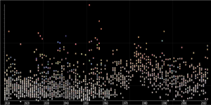
With this graph, the higher the cover is on the y-axis, the more colorful it was. Throughout the years, the covers significantly got brighter and the saturation increased especially during the 1980s.
Going along with Colormetric Space, Cover Averages was an experiment that illustrated the visual continuity and changes throughout the decades. Their presentation focused on overlaying pictures and generating a mean RGB value for every pixel of an image.
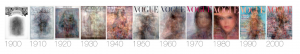
Even though there are multiple layers of magazine covers overlapping one another, we are able to see the general trend which is that as years go by, the covers become more saturated, brighter, and colorful. Additionally, these images help determine whether the covers are similar and have a clear pattern or if it is completely different and diverse. For example, in the 1980s, the Vogue covers were fairly uniform and consisted of a woman’s face and in the 1940s, we are unable to see a clear visual.
Hi there,
I loved your analysis of the project. It was simple to understand but it highlighted the goals of the project and gave a compact summary of the data. The graphs that were analyzed are very interesting and are great examples of what the author hoped to reflect in the research. The covers really do show interesting trends that a variety of scholastic fields can pull information from.
Hi,
I enjoy reading your well-organized and concise blog posts. I especially like how you split the post into clear categories to make it easier to follow. You did a great job reverse engineering the site in details. I agree with you that the site is easy to navigate and that results are interestingly presented. The Cover Averages experiment is a fascinating way to explore how beauty cover pages have changed over years and this project really provides interesting information that could be used by different fields in the humanities and social sciences.
Hey there,
To the same sentiment of the comments above, I appreciated the simplicity and clarity of your post. In comparison to the other posts on the Robots Reading Vogue site, I had the easiest time understanding what you had to say and processing the information. The way it’s broken up seemed to really help organize the different points as well.