My network diagram is based on the short story “Sorry to Disturb You” by Jack Underwood, which is about the supernatural voices the unnamed narrator hears during his time working in a mortuary.
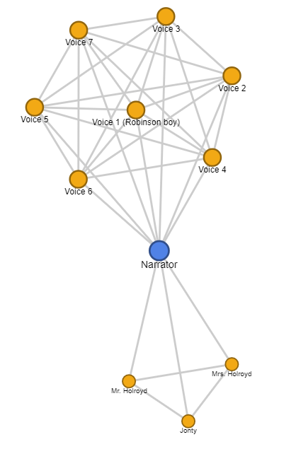
My interactive version of my network diagram can be viewed here. The diagram clearly centers around the narrator–which makes sense, because the story is told from his point of view. It illustrates a clear separation between the groups the narrator interacts with; his coworkers at the bottom, and the voices he hears at night grouped at the top. The diagram turned out illustrate the two different lives the narrator lives in the daytime, at work, and at night, as he listens to the voices of the dead.
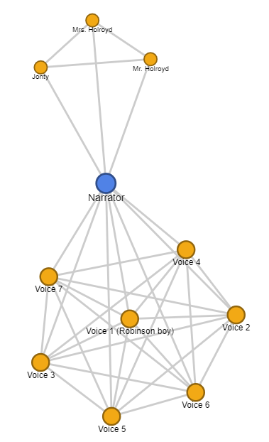
One thing that can be misleading about network diagrams is position–nodes are placed arbitrarily, but a viewer of the graph might (even subconsciously) assign value to names based on their relative position. For example, the diagram below might suggest a different relationship than the one above. (Is the narrator being pulled metaphorically “down” by the voices?)
One hing network diagrams cannot show is the changing nature of relationships–the narrator is linked to the people who are his co-workers for the majority of the story, but he is let go at the end–how can this shifting relationship be depicted in the diagram?
Your network diagram is really thoughtful and it easily brings me into the story itself! I also like how you point out what the network diagrams cannot show.