This dataset produced by the city of LA, is based on information technology on phone calls/app requests to the 311 service. It specifically documents the cases of illegal dumping as reported to 311. This data is displayed both in a map as well as via a data table. This allows for general visualization of the data as well as an ability to hone in on specific data points. The information used to document these cases include the date of the call, the date the problem was resolved, the type of action taken, the city department employed for the report, the source of the request, location of the request, reason code, and the police precinct name among others. The data is extremely detailed and highly accurate. It even includes a category for determining whether the location pin displayed on the GIS map was precisely inputted or placed via moving a pin on the map.
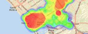
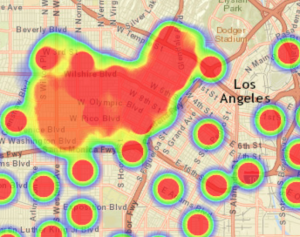
This data is most useful for sanitation workers, public policy decision makers, police precincts, and public health officials. This data set, due to its thoroughness, allows for an exemplar map for locations of littering and perhaps offers an insight into the whereabouts of a homeless community. The water areas around Marina del Rey and Venice, water-front areas, are especially populated with calls regarding illegal dumping. This does not necessarily however mean that there is more dumping in these areas, but could be that there is more community and public monitoring of this dumping as it is a popular beach-front area. Further down Olympic and Wilshire boulevard is another concentration of illegal dumping activity. As you can see, the map and data from this data set allows for analysis and information on many related topics beyond where there is the most improperly managed trash. The mapping of this data serves as extremely useful to understanding locations of interest.
As I mentioned in the last paragraph, what gets left out is the fact that the most highly populated illegal dumping areas may not necessarily even be where this is the biggest issue. They could simply be where this activity is most reported. Additionally, policy makers must be careful if they were to set higher fines in these more populated areas, it could disproportionately affect lower income individuals and have a detrimental affect to the area due to harsh and undue punishments.
If I were mapping this data, the given ontology is very useful and highly detailed. However, I would perhaps add a column which includes the wealth level of the given precinct. As this gives an idea for the kind of population which is dealt with in those areas. Similarly, this data only shows values from 2016 and does not show the magnitude of the problem in any way. Perhaps adding information on the levels of illegal dumping could pose a more accurate map. This is because areas with lots of reports of illegal dumping does not tell us whether the dump was a few candy wrappers or a half dozen trash bags of trash.
Data Set Source: https://data.lacity.org/A-Well-Run-City/MyLA311-Illegal-Dumping-Heatmap-2016/8nji-2y3b
What a cool data set! I really like those visualizations that are depicted in your post. They make it easier to understand the problem of illegal dumping.
You bring up several interesting points about illegal dumping, such as who benefits from this data the most. I can already imagine Westwood having a bunch of illegal dumping. Also, your point on the idea of who is actually reporting this data is essential to taking a multifaceted look at this data and how it operates.
Do you think it would be helpful to know what kind of items were dumped? For example, let’s say one of the “hottest” areas mostly dealt with electronic dumping, while a “colder” area dealt with more sewage dumping. This info could skew the data due to the difference in materials and potential hazards to public health. I suppose the city department employed for the report category does kind of narrow down the material, but I still think a material column could be extremely vital.
I liked how you included visual examples in your blog post! It was interesting to see these hotspots of areas where illegal dumping was most prevalent – it’ll be cool to see correlations between what sort of products are dumped and where illegal dumping happens most frequently (and also how quickly the rubbish can spread depending on water flow and other geographical features of the surrounding area). I also appreciated the fact that you mentioned how lower income neighborhoods can be adversely affected by higher taxes on areas with higher dumping rates. It is really important to gather all the facts about a certain location before making judgment calls about what to do in order to rectify an issue since it can end up impacting a lot of people.
This is so interesting,
I was not aware that this service even existed, your inclusion of the visualization really helped in understanding the ontology. I completely agree with your critics of the ontology. The data would present more useful and relevant if they also presented data on the waters actual pollution levels. This would also provide insight on how efficient the service is, rather than just the communities that are aware of it’s existence.
I like how you raised the concern of what information got left out – that is, the illegal dumping in the heat map is really what’s been reported. There could be far more that just hasn’t been noticed or reported. I am interested in knowing what in particular gets “dumped”, as I know during the end of the school year, the UCLA neighborhoods are kinda trashed with furniture and junk – does that count as dumping?