I read the story, “Given,” by Jesmyn Ward, and immediately noticed where my network graph would be lacking. On the other hand, I was really surprised by how easy it was to generate a graph using Google Fusion Tables. For a Communications class I took this past summer, we had to create something similar, and it would have been very helpful for me to have known about this.
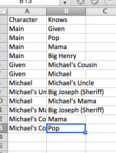
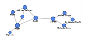
I chose to make my connections solely based on direct mentions of interaction in the story, which is why connections such as “Michael’s Cousin” and “Michael” aren’t drawn. I also quickly realized that this form of graphing data immediately overlooked differences in time. For example, the story clearly states that the Main character (unnamed in the story so just named Main in the graph) didn’t know Michael’s cousin before the “hunting accident,” but they met in court after the incident. It would be interesting to see a video form of this graph showing how connections and ties form overtime, and how social bridges get formed.
Another important quality mentioned in the story but difficult to illustrate is each of the character’s race. A few times, race is explicitly mentioned, but not always, leaving characters like Big Henry and Big Joseph ambiguous. It is difficult to express these differences on a graph such as this without making it more complicated.