For this post, I chose to analyze Kaori Fujino’s You Okay for Time?. This fictional short story details the relationship of the narrator, Yoko, and her best friend, with most of their interaction through phone conversations and largely revolving around Yoko’s gift of a Sansevieria plant to the friend.
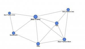
Below is a network graph made of the characters in this story and their connections.
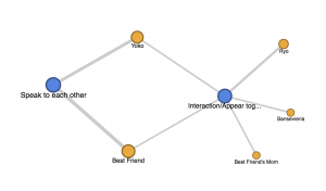
There are two edge types: one defined by conversation, and the other through interaction or appearing in the same scene. Since the story unfolds mostly through the phone, I thought a graph showing links between edge type and nodes would be interesting.
This second network graph, though not inclusive and skewed, gives a better representation of the relationships between the characters. While almost all the characters interact on a certain level, the primary relationship is between Yoko and her best friend. The best friend is the link between the other characters, and the second graph depicts that more accurately.
In the former network graph, links are shown between different nodes and while more objective, this network graph doesn’t depict the isolation of the narrator from the other characters. The quality of interaction isn’t depicted by just a simple edge. Though Yoko interacts with almost all the characters, those interactions are superficial and transitory. It mediates it by proportioning node size to the number of interactions and from this, we can see that Yoko’s best friend is a dominant force in that regard. However, the Sansevieria is also a primary character but given its limited physical interaction with other characters and its background presence, it seems to be a much less significant than it truly is. I think many of the limitations of network graphs stem from the human component of making these graphs, as choosing how to determine what qualifies as an edge and even the arrangement of these nodes in a list impacts each graph significantly. This exercise illuminated for me how relationships are lot more complex to depict in simple visualizations than I had previously thought.
*Images are placeholders until I can embed the graphs
Hi there! I think WordPress security settings are preventing the iframes from showing up, so screenshots & a link are fine. Great post!
I thought that this was a very insightful post. I liked how you decided to focus on communication between the characters and used multiple network graphs to further tease apart this story. It was quite easy to relate to your process when you talked about how visualizing relationships is actually a complex problem, since I ran in to similar realizations with my tale. Human decision making is definitely a huge factor in how these characters are represented and the opinions that people draw from such graphs. Good Job!
I really liked reading this post. I thought it was interesting that you made a graph showing edge types because then the limitation of not being able to know the basis of connection (based on one network graph alone) is overcome. The concern about choosing what constitutes an edge was something I had too; I considered several different criteria when thinking about my post and realised this influenced sometimes even the number of characters who would be depicted in the graph. Thank you for this post!
Really great work! I like how you made two diagrams to represent the interactions differently. I similarly had trouble deciding how to define an interaction, and from your diagrams it is really clear how the way we define the data can impact the visualization output. The human component is definitely a factor that comes into play, as relationships are definitely not clear-cut and easy to define.