I did my blog post on the short story The Martians Claim Canada by Margaret Atwood on Granta. It was about three martians that landed in what is supposed to be Canada, although they wanted to land in New York. The three martians wanted to land in New York so they could see a musical. They encounter a mushroom in Canada that tells them that they are actually in Canada, and not New York. The martians know nothing about countries or human lifestyles and tendencies, and so they question the mushroom and ask the mushroom about where they might be and what humans are like. Ultimately, the mushroom’s answers are a bit biased because it is not a human and it could only perceive human tendencies through its own lens. There were only four total characters in this short story.
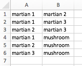
There characters were all connected in my opinion. I based this off of the fact that three out of the four characters in this short story were martians and the fourth was a mushroom. They are all related because the martians are all martians, and because all of the characters conversed with each other. Therefore, my excel sheet looked something like this:
Because this short story only had four characters overall, and so only four nodes, the fusion table looked relatively simple. Because my characters were all related because of the characterizations that I based the fusion table on, my chart looked something like this:
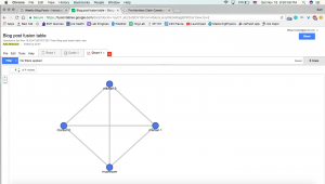
and here’s the link to my fusion table.
This graph only represents which characters are related. In my opinion, there are many limitations because the graph does not represent how the nodes are related and if they are related in more than one way. Furthermore, the martians are more related to each other than the mushroom is because the mushroom is not considered a martian. The graph does not depict this either. I wish that maybe the nodes for martians 1, 2, and 3 were clustered together to depict this.
In terms of our group’s final project on the Williams College art collection, this graph would be useful to exemplify how related the artwork we choose to work with are. A potential category our group would use to characterize relationships would probably be the artist of a painting. With a fusion table graph, it would be easy to visualize if there were particular larger and smaller groups of nodes which would mean that one artist has more work in the WCMA than others. However, the graph would not include the name of the artist, just the name of the art piece(s). Because of this limitation, our group would probably have to caption this graph, if included in our final project, with what artist represented a big cluster of nodes and vise versa for a small cluster of nodes.