Caribbean Cholera seeks to give a temporal and geographical representation of cholera outbreaks in the Caribbean during the 19th century. It gives point data of outbreaks, hurricanes, tropical storms, and news articles tracked by each year. This is not an all-comprehensive map, but rather one that tries to present information about cholera outbreaks and the conditions that could’ve contributed to it, which in this case is assumed to be weather and climate. Turnbull posits that maps are always selective due to the human agent that produced it and this map is a good example of that. If we were to take the map as the only account of Caribbean cholera, it could be assumed that weather is the primary factor that contributed to these outbreaks. Another thing to note that most of these articles are taken from Western sources, such as the Boston Evening Transcript and the Wisconsin Free Democrat. These perspectives depict the outbreaks from the colonizing community’s perspective but leave out local experiences. Not only local experiences, but also first-hand accounts and more “informal” sources of information. From what I gather, most of the people affected are the locals and those that are marginalized. It’d be a much more comprehensive, if not more accurate, map if these perspectives were included as well.
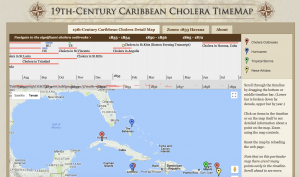
This map’s strength lies in its representation of outbreaks on a time scale. It gives a great representation of related events by year, as a detailed monthly timeline is given as well as a yearly visual underneath with colored bars that summarize the types of events that occurred. It’s interactive as well, allowing for the user to scroll through the years to get a sense of how the disease progressed over time. However, what it fails to express is the impact of the disease. All that is shown on a visual level is the type of event that occurred and point data on where these events occurred.
Instead, another interpretation to better help the user understand the extent of the disease would be to represent outbreaks not only denoting location, but also extent of impact and intensity. This can be done using proportional symbols, most likely circles to encompass an area, with graduated sizes that represent quantitative values. The bigger the circle area, the greater the impact. This then could give the user an immediate sense of the effects of these cholera outbreaks.
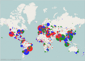
If not graduated sizes, a choropleth map could be used instead, where the points used to represent outbreaks are colored accordingly in a gradient to indicate the number of deaths or intensity of the disease. I think these techniques are helpful alternatives to give users an immediate visualization of the gravity of these outbreaks, instead of just geographic plots of where the outbreaks occurred.
Hi there!
While I didn’t do my blog post on this particular mapping project, I found it pretty interesting! Seeing a visual representation of cholera outbreaks and the conditions that could’ve contributed to it would be useful. I really enjoyed your analysis. Great job!
Your post has connected with Turnbull’s opinion of maps detailly, and I totally agree with your suggestion for how to improve the map. Thank you for paste a sample map on your post help me to learn your idea.
In this weeks posting I did not even take the time to review this map. I am glad you did because it is very interesting, you executed the assignment perfectly. Your ideas on reflecting the degree to which these diseases spread and their over all affect was great, and really added to gaining an alternative perspective I would not have taken away if I had not read your post which is relevant to all the natural disasters that are still occurring !