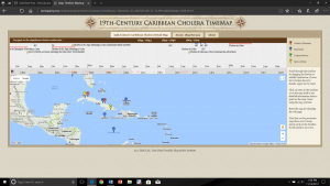
The Caribbean Cholera Timemap shows outbreaks happened in the 19th century at the different time period in the Caribbean. There are four kinds of coordinates with different colors (displayed color legend on the top right side outside of map) shows on the map:
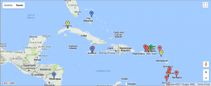
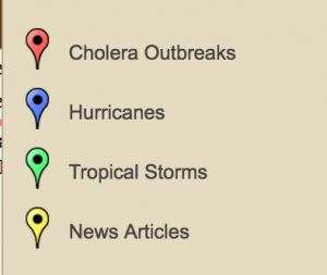
- Cholera outbreaks (red coordinates): when click, shows location, time, and sometimes the number of people died.
- Hurricanes (blue coordinates): when click, shows location, time period, and accurate longitude and latitude.
- Tropical storms (green coordinates): when click, shows location and time period.
- News articles (yellow coordinates): when click, shows location, time, and event summary in one or two sentences.
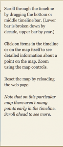
In the website, users can scroll the timeline (upper bar shows the year, middle shows the month, and the bottom shows decade) to the left or right to see events happened in each decade, and right side webpage has instruction about how to use this map accompany with the timeline.
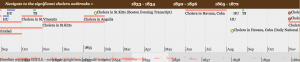
Base on the information is provided (location, time period, and the number of people died), this map helps people to have an overview of outbreaks happened throughout the 19th century. Map designer has assumed users know some background about this area and events (like population, weather, culture) so that he/she only need to provide minimum but key information (like location, time period, longitude and latitude).Therefore, if users want to know more information, they need to search more details online or from other resources. Although, designer draw timelines for which events which make time period of an event easy to visualize. For the information above, the maps appear perspectival and subjective as a whole.
Alternatively, in order to make the map easier for users to identify those events, I think designers could create a section on the left side for summary and description for each event so that when users click on each coordinate it will reveal not only the location and time period but also some details about what was going on.
Hey ranranni,
I found this map interesting and I agree with you about including a summary on the side for more background information on the data provided. Not everybody knows about the history of cholera in the Caribbean and it could provide useful information.
This is a great blog post! I like how you did the extra work and added in pictures of the website and then described in detail what it was for and how to understand the information. This looks like a very handy website. Good job!
I find it interesting that the four coordinates report slightly different information about the outbreaks that occurred! Similar to your analysis, the ReVilna mapping project I took a look at also provided the minimum amount of information because the map designer assumed users have some sort of background information on the topic. I think incorporating a description and summary on the left panel in order to provide additional information is a great idea!
I also chose this map, but I like how descriptive you got with the technicalities of this map! I didn’t go into as much detail as to the map design and spent most of my blog post critiquing how it represented mass deaths. I like the extra pics you included too!
I also decided to analyze the Caribbean Cholera Map for this week’s blog post. Like you mentioned, additional detail can definitely be added to each event. Although information like the date and location are mentioned, the map fails to provide any other detail about each outbreak. I personally found this map to be formatted a little bit confusingly with the news articles being included in the legend and the timeline a bit hard to read. I was wondering if you also felt this problem?
I really enjoyed this blogpost. The pictures and bulletpoints allowed for a thorough, yet easily understandable explanation of the website you chose to analyze. I wanted to point out, additionally, that it’s not uncommon for digital humanities projects to assume their audience’s knowledge; this lack of background information was also present in the site concerning London and the Vilnius Ghetto.