The interactive time map provides data on significant cholera outbreaks in the Caribbean. It also provides information on hurricanes, tropical storms, and news articles in the area. You can navigate the map in two different ways: either dragging the timeline to a specific month and year, or by clicking on the yearly intervals on top of the map when there were significant cholera outbreaks. This can be useful by letting the user browse through the months and years to see a specific change or by providing the user data from a specific time where there were significant cholera outbreaks. Turnbull says that all maps are perspectival and subjective. This map may be perspectival in that it seems to have been made by a non-local organization. If this map were to be made by those affected in the Caribbean or living in the Caribbean, the information might have been more accurate and inclusive. The map reflects a non-local point of view and assumes the reader is aware of cholera and the effect it had on the Caribbean. It does not talk about statistics in terms of why a specific year had a significant cholera outbreak or how many people were affected. The map reveals and does a good job in providing information of the cholera outbreaks on a time line. It shows where the outbreak occurred and in addition where related events occurred as well, in a simple way effective way. The map obscures, as mentioned, the statistics of the events. How many people were affected? How many died? How had this affected their society and everyday life? This information is important in that it provides an overall knowledge of the event, not just where it was located and when.
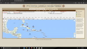
An alternate map would have better overall knowledge of the events. It would include information on specific information such as the population affected in relation to the total population, what years were the most significant and what made it significant, in addition to other background and related information that the reader can benefit from. In terms of how the map was presented, it can be made a bit more visually pleasing. The map can incorporate a color scheme that would highlight the areas affected and their severity through a darker shade of a color. Instead of a pin located in one area showing the location, the shade of color can show the entire area that was affected.
Great post! Based on your analysis, it is evident that a more inclusive point-of-view is necessary in order to fully understand the scope and breadth of the cholera outbreak; however, what should researchers do if say for example they did/do not have the resources or information necessary to provide that inclusive point-of-view? Also, in this case, what can one gather from the map? In what ways can it be useful, since it appears to be lacking a complete picture of the outbreak? I completely agree with you on the design interface of the map. In fact, I found that all of the projects could have been revamped visually to better present the data to the viewer.
I like what you say about what a map would look like with a local point of view. I wonder if it would include institutions that are really important to locals — like key houses of worship, restaurants, community centers, perhaps even the residences of major civic leaders.