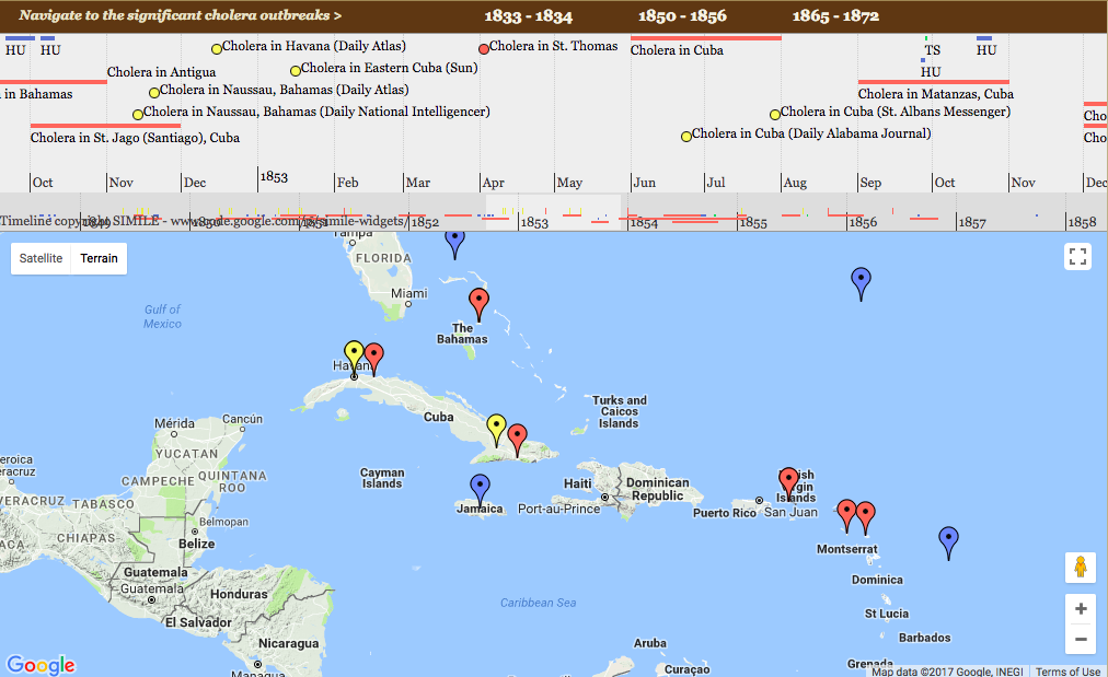
I chose to look deeper into the 19th-century Caribbean Cholera Detail Map. The map is focused on the Caribbean while it is the dates that one changes and we see the points on the map change in turn. There are four different colored points: Cholera Outbreaks, Hurricanes, Tropical Storms, and News Articles. We can assume through this that the cholera outbreaks are related to when and where the hurricanes and storms take place. We also then see where the news is to better understand when it was understood there was an outbreak. The assumption of the map is that there is only a correlation between storms and cholera. There are no other causes highlighted. There is also no info on any deaths. Alternatively, there could be a map that shows where deaths happened and how many for each region. Still using the function of browsing through dates, we can see either the increase or decrease in certain years of cholera-related deaths.