This week we are exploring various mapping techniques and how we can apply these to our own digital humanities projects. I chose to explore the Mapping Decadence project which plot twist was actually not about food whatsoever. The project aims to geographically visualize relations between authors and publishers of the Decadence Movement, which was a cultural, literary, and artistic movement of the 19th century. To better inform myself, I gracefully Googled a definition and found this:
“The [Decadence] movement was characterized by self-disgust, sickness at the world, general skepticism, delight in perversion and employment of crude humor and a belief in the superiority of human creativity over logic and the natural world” (Wikipedia, the best source (; )
Assumptions, Revelations, and Obscurities
The goal of the project was to show that physical proximity largely determined which Decadent authors would collaborate with certain publishers. This can be easily seen in the maps through color coordination (see below). However, I think it is important to note that there are only four Decadent authors featured in this map. To make a wholistic claim regarding geography and collaboration, there should probably be many more creatives from the Decadent era documented within this map. This obscures our POV of the data and shows that the maps were more tailored towards the mapper’s hypothesis and own POV. It does overall reveal that this pattern of physical proximity could be well-assumed for many large authors of the Decadent Era.
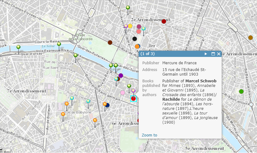
If I were to envision a new version of this map, a lot more data would need to be included to add more authors and artists of the Decadent Movement. It’s difficult to claim something about the era as a whole when people from the entire era are not represented. I would also color code the publishers to be coordinated with the individual authors they worked with rather than just giving each publisher their own color. This makes it a bit confusing to follow the correlation between each author and their publishers. In my opinion, adding specific author-publisher colors would better highlight the relation the mapper is trying to show in the overall project.
I like the title of your blog post 🙂 I agree that this visualization would be able to provide a stronger argument if it had data about more Decadent authors, rather than just 4. I also think that the colour coding system that they used was a bit confusing, just from looking at your picture, so your suggestions would be a good idea.
Hi!
Thank you for your clarification on the map, I think initially I didn’t want to do my blog on this map because I thought it was very confusing though the visualization does offer clear information. After reading your blog, I feel like I have gained a better understanding of the map.
I agree that there should have been more authors, but this was a project done by a single student named Katie Jacobs. She mentions that many different authors would have required a lot more time and a lot more people, which is why that may not have been possible. However, I do agree that the pinpoints for the authors should have a color corresponding to the author that they worked with. Maps are all about visualizations and finding correlations and that color correlation would definitely help me do this.