Lindsay King and Peter Leonard of the Yale University Digital Humanities Department built a project called “Robots Reading Vogue.” The project linked data mining and fashion/magazines/media by clearly illustrating the seemingly incremental changes in Vogue magazines (and more generally fashion trends) throughout the 20th century and a bit beyond. These changes were measured by exploring and organizing the color, style, and covers of countless Vogue magazines.
Sources
It’s explicitly stated on the site that Leonard and King gathered 400,000 pages, 2,700 covers, and 6TB of data. The sources ranged from Vogue covers dating back to the year 1892 through present day (2017), in addition to Vogue Archives from Proquest LLC launched in 2011.
Process
Leonard and King worked to take the massive amount of information gathered from their sources and organize it in order to make it easier to process and study. They implemented numerous statistical methods (such as n-gram search, color analyses, slice histograms, topic modeling, colormetric analysis, cover averages, etc.) to break down the trends seen through the magazine in categories such as advertisement, covers, total circulation, and actual content of the magazine itself.
Presentation
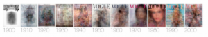
King and Leonard were thorough in the processing of their sources which allowed them the ability to present a project that was easy to follow and comprehend. They presentation was organized into graphs, charts, tables, images and histograms – each providing the reader with a different way to view the information. Not only is the presentation easy to follow, but it’s interesting. Being able to look at Cover Averages of each decade’s covers and present it visually is phenomenal. At the same time, the cover averages experiment demonstrated, much more clearly than words could’ve, the massive differences in the color and subject of each vogue cover (The Colormetric Space experiment illustrated a similar idea, but through a dotplot). Both the colormetric space experiment and the cover averages experiment make it simple to see the trend and increase of color and brightness of each cover through the years.
See below the cover averages experiment:
Overall, Leonard and King’s project was an impressive example of the things that a little bit (or a lot of) data analysis can prove and illustrate. Prior to viewing the project, I would’ve assumed every Vogue cover was more or less the same. Now I can tell you in great detail how different they are and the trends that they follow – and I could do so even if I had only viewed a couple of the graphs and histograms presented.
It’z crazy to imagine how many pages of magazines that the project members had to comb through to complete this project! Your explanation of the presentation of the website made me feel more inclined to check out the project again, this time to better appreciate the efforts that Leonard and King put into the project. I also like how you included the information that you gathered from poking around the project as well (in the last paragraph).
Hey, I did my post on the exact same topic. I liked how you broke down the question into separate parts and how you emphasized the massive amounts of data and work that needed to be done. I also liked how you talked about how small differences eventually added up and made a difference to you as a reader when one could initially feel like there isn’t much difference at all!