For week 1, I reverse engineered The Shape of History: Reimagining Elizabeth Palmer Peabody’s Historical Visualization Work. In her project, Elizabeth Palmer Peabody transforms data into a grid chart that utilizes an interactive historical map. Instead of a normal timeline, Palmer’s chart organizes the data in a story-like format that shows an intuitive progression of events and the events’ relationships with each other, allowing for the reader to learn quickly and effectively while making connections between events.
Sources:
Under the “Site Information” tab, the creators list their credits and sources. They list the American Antiquarian Society and the Library Company of Philadelphia as the sources primarily drawn from. All sources were mainly open source libraries from different online databases. The creators built the project using HTML5, CSS, and Javascript.
Processing:
Processing data and information involves a variety of methods: organizing, editing, correcting, statistical processing, enhancing, photographing, etc. The “Explore” page organizes historical events into an interactive chart, which is evidence of data organizing. The “Compare” page uses organizing as well as statistical processing to organize the dates and information. Furthermore, the “Play” page enhances the depth of information by allowing users to toggle with the data themselves and organize it themselves, which is evidence of data processing and and manipulation. Clearly, the original data set has been edited, enhanced, and reworked in a way that allows for the interactive interface that the site provides.
Presentation:
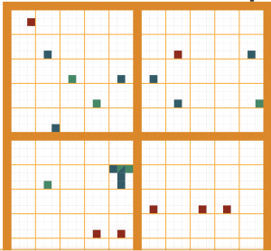
Data is presented when it is visualized, made web-accessible, mapped, made searchable, and made interactive. The data is clearly visualized in a grid chart format, with different squares within the grid symbolizing different events. The information is very accessible and the site is intuitive, with tutorials and instructions on nearly every page. Again, interactive interface allows the user to navigate the site easily and allows for a self-guided lesson on history. The site utilizes a main menu/dashboard to organize the different pages and provide a way to navigate the site.
Palmer notes that the conversion from grid to timeline reflects her own sense of history as a form of data. Because each event is “defined by its actors and type,” this allows for each event to be translated into a data object. Palmer found that this was the best way to visually represent history, and was able to do so through a variety of ways as reflected in the project.
Hi there!
Great explanation of what this project is and how it was presented. I really enjoyed how you explained how the author presented the data available, it gave great insight into why the author choose this first and how it enhances the learning experience. Furthermore, it was great that you included how the author understands history and the relation that had to the project. I think her user of data is very best because I think the biggest problem when analyzing data is that most people have a hard time conceptually processing it. The use if interactive data alleviates this problem.