
NOTE: Scroll down to get to the tutorial itself!
Updated November 2015 for Palladio 1.1. If you’d like to use this tutorial in the classroom, or if you want to alter it and make it your own, there’s a version on Github you can do whatever you want with.
Palladio, a product of Stanford’s Humanities + Design Lab, is a web-based visualization tool for complex humanities data. Think of Palladio as a sort of Swiss Army knife for humanities data. It’s one package that includes a number of tools, each of which allows you to get a different angle on the same data.
Palladio is relatively new and still under active development which means that you will almost certainly encounter bugs! Still, it’s a very useful tool for getting a handle on a complicated dataset.
When Might Palladio be the Right Tool for You?
You have structured data.
Here, “structured data” means “data in a spreadsheet”: categorized, sorted, and stored in an Excel document or some other kind of spreadsheet application.
You’re interested in time, space, and relationships.
That’s where Palladio excels: showing you how various entities are connected across time and space.
Your data has many attributes.
Palladio’s really good at helping you uncover relationships among disparate attributes over time and space for example, it can help you see that a diarist was especially interested in trees as he traveled through North Carolina, and especially interested in bats as he traveled through Arizona. Palladio allows you to drill down through your data using faceted browsing.
When Might Palladio Not be the Right Tool for You?
You have unstructured data.
If you’re trying to analyze a long text, like a poem or a novel, Palladio won’t help you much. You’ll want to look for text analysis tools, like Voyant (http://voyant-tools.org/).
You just want to count things.
If you just want to make relatively simple charts and graphs, like a bar or pie chart, Palladio is too much tool for you! Instead, try using Excel’s built-in functions, or check out tools like Plot.ly or Tableau.
You want to present an interactive visualization.
One big limitation of Palladio is that you can’t embed or share the visualizations you create, except in static form. So while Palladio can help you explore and understand your data, it’s not great for presentation, at least not yet. Instead, try Google Fusion Tables, ManyEyes, or Tableau.
You want to create complex, fine-tuned maps and networks graphs.
While Palladio can produce maps and network graphs, you can’t customize them to any great extent, and you can’t perform sophisticated network analysis, such as calculating various measures of centrality. Instead, you might consider more sophisticated mapping tools, such as CartoDB or ArcGIS, and more sophisticated network analysis tools, such as Gephi and Cytoscape.
You hate bugs.
Palladio is still a baby, and you will almost certainly encounter some bugs. If you prefer not to use unstable software, you might investigate Google Fusion Tables or Tableau.
With that out of the way, we’re almost ready to get started using Palladio. First, though, a quick note that this tutorial does not cover some important features of Palladio, specifically its ability to link multiple data tables together, its timespan feature, and a feature that allows you to use multiple basemaps. Perhaps these will be the subject of a later tutorial!
A word on the dataset we’ll use, which you can find here.
This is a spreadsheet that contains the metadata for a portion of the Charles Weever Cushman Collection of photographs, located at Indiana University. The full Cushman Collection contains more than 14,500 Kodachrome photographs, taken between 1938 and 1969. Indiana University’s archivists were forward-thinking enough to place this data on Github, which is how we’re able to use it.
In order to make this data a little easier to work with, I’ve limited this spreadsheet to photographs taken between 1938 and 1955. I’ve also removed the “End Date” field to prevent confusion, changed the format of the date field, and added geocoordinates so that we can map the data more easily. For a great introduction to how to do some of this data manipulation on your own data, see this handout, developed by Owen Stephens on behalf of the British Library, which explains how to use the data-cleaning application OpenRefine.
A reminder that Palladio is still under development, so it can be buggy and slow! Some tips:
- Work slowly. Wait for an option to finish loading before you click it again or click something else.
- Do not refresh the page. You’ll lose your work.
- On a related note: To start over, refresh the page.
- Clicking on the Palladio logo will bring you to the Palladio homepage, but it won’t erase your work.
Navigate to Palladio.
Go to palladio.designhumanities.org and click on Start.
Upload your spreadsheet.

Click on the Load Spreadsheet or CSV tab and drag your spreadsheet onto the tab. (If you have an Excel spreadsheet, save it as a .csv file before uploading it.) Then press Load.
Hey, you imported your data!
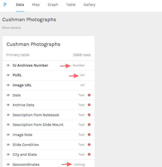
As you can see, each column in your spreadsheet is a different category of data. If you look closely, you’ll see that Palladio has automatically categorized your data as different datatypes: “IU Archives Number” is a number, for example, while “PURL” is a URL. And if you scroll down, you’ll see that “Geocoordinates” is Latlong.
Tell Palladio what kind of data you have.
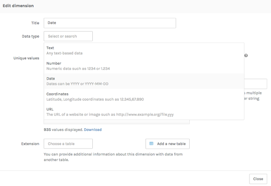
One of your data categories is a date, but Palladio hasn’t figured that out right away. We need to tell it, so that it treats this particular category as temporal data.
Click on the Date category. In the window that pops up, select Date from the Data type dropdown menu. Looks good! Click Done.
Hide some data

We have a lot of categories here, and Palladio runs a little faster if it has fewer of them to deal with. (Plus it’s easier to see what you have.) Let’s hide some categories we won’t be using by clicking on the tiny eye to the right of the category name. I hid Archive Date, Description from Slide Note, Image Note, and Slide Condition. You can always go back and reveal these if you decide you want them after all.
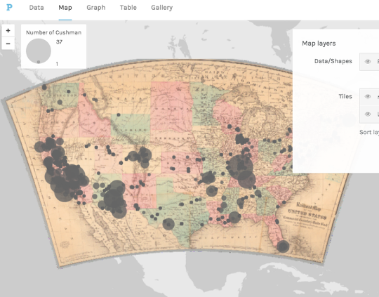
Map your data!
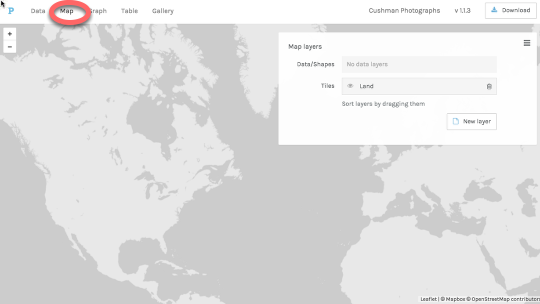
Click on the Map tab at the top of the window to go to the maps view of your data. Before we go on, let’s talk about what you see in the Map layers pane that appears in this window.
Palladio expects you to map your data in layers. This means that not only could you map one kind of thing, like photos; you could layer other kinds of things on top of that data. For example, it might be cool to have a layer of Cushman’s photos and a layer of interstate road networks, to see if Cushman traveled on highways. Palladio lets you do that!
But for the time being, we only have one layer: Cushman’s photos. So we’ll stick with that.
Map your data! (2)
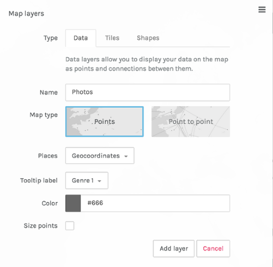
Let’s tell Palladio what we want in our layer. We can name the Layer whatever we want. I’ll call it Photos.
Keep the map type as Points. If you happened to have data that depicted the movement of objects from place to place, you could do a point-to-point map. But we don’t have that kind of data.
If you click on the Places box, you should be able to choose Geocoordinates from the dropdown.
The Tooltip Label, which controls the label you see when your cursor hovers over a point, can be anything you want. I’ll call mine Genre 1, since that gives me some sense of what’s in the photo.
When you’ve done all this, press Add layer.
You have a map!
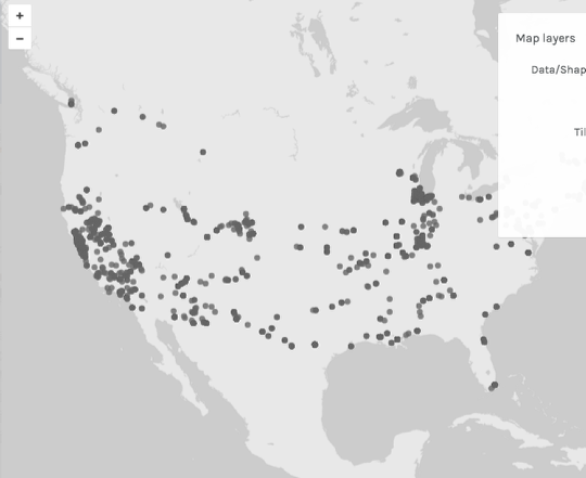
Looking good! If you hover over a map point, you should get a tooltip.
Combine your map with a timeline.

The ability to put data on a map is cool, but the real power of Palladio is the ability it gives you to explore the relationships of various features of your data through Facets and Timelines. Let’s start with a timeline, which is pretty much what it sounds like: a visualization of the distribution of your data over time.
Start by clicking on Timeline tab at the bottom of your screen. Group your data by Genre 1. Now you can see the distribution of photos over time. That’s interesting: looks like Cushman took a lot of photos in 1952.
Filter your data by date.
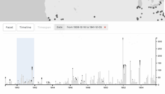
On the bottom graph, use the crosshairs to drag (slowly!) from 1940 to 1942. A blue box appears to indicate that you’re filtering your data by date. You’ll notice that the points on the map repopulate to correspond with the timespan. You can even select multiple spans of time and see them visualized simultaneously!
If you want to temporarily collapse your timeline so that you can see the map better, click on the downward-pointing arrow on the right of the timeline pane. To get rid of the date filter, click on the pink “x” next to the datespan above the graph.
Note: If you’re unable to “grab” your timeline in order to filter it, it may help to lengthen your browser window.
Add a facet to further refine your data.

You’ve now narrowed your data down to 1940–1942. Now let’s try filtering and visualizing your data using other attributes. We can do this with a Facet filter.
Click on the Facet tab. (You’ll probably want to compress your Timeline window by clicking on the downward-pointing arrow that appears on the upper right-hand corner of the pane.)
Click on the Dimensions menu.
Now select Genre 1, Topical Subject Heading 1, and Topical Subject Heading 2. (Actually, you can select whatever you want; I just think these are fun ones to try.)
Explore your facets.

Working from left to right, the facet dimensions gradually narrow down the data displayed on the map. For example, in the image above, the map will show where Cushman took landscape photographs that contain both trees and shrubs. (Only on the East Coast and Great Lakes! Wonder why.)
Try playing with some other facets and altering your timeline. Find any interesting relationships?
(You might wonder about the Timespan tab, which is greyed out when we use Palladio with our dataset. If our records had start dates and end dates, the timespan function would display those dates as “lifespans.” Take a look at this video for an explanation: https://vimeo.com/101672780.)
Explore your data as a gallery.

Maps are fun, but galleries can be useful, too, especially when you’re working with images. First, delete your time and facet filters by clicking on the tiny pink garbage can that appears at the lower right-hand corner of each pane. (You can also delete them by clicking on the pink X’s at the top of the filters pane.)
Now, click on the Gallery tab at the top of your window.
Change the categories your gallery displays.

So far, not very useful. Let’s change the categories your gallery is displaying. For Title, choose City and State. For Subtitle, choose Genre 1. For Text, choose Description from Notebook. For Link URL, choose PURL. For Image URL, choose Image URL. If you’d like, you can sort your gallery by Date.
(Actually, you can put whatever you want on these gallery cards, but these are some categories I think are interesting.)
Filter your gallery by date and other attributes.

You can filter your gallery in the same way that you filter your map. For example, in the above image, I’m looking at pictures taken in Chicago that contain both clouds and buildings.
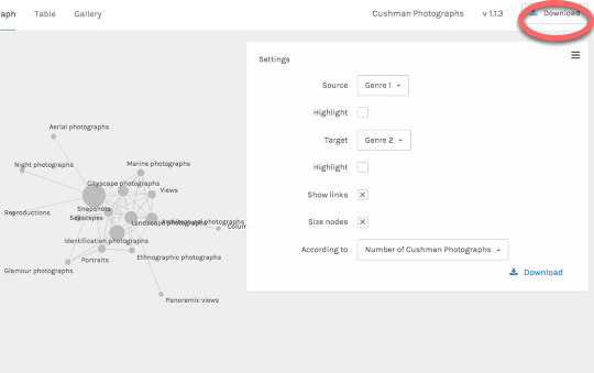
View your data as a network diagram.

Network diagrams are good for showing the relationships among entities. Often, those entities are people or objects, but we can use subject headings as our entities, too.
To view your data as a network diagram, get rid of your filters and then click on Graph. (Palladio is using the term “Graph” the way computer scientists do, to mean exclusively a network graph.)
Set the parameters of your network diagram.

In order to create a network diagram, you need to tell Palladio which two attributes of your data you want to explore. For Source, choose Genre 1; for Target, choose Genre 2. Now you can see which genres tend to co-occur in Cushman’s photographs. You can click and drag the nodes (the circles) to explore your diagram.
To highlight one kind of node in order to distinguish between the two, click on the Highlight checkbox. To size nodes according to the number of objects they represent, click on the Size nodes checkbox.
And you can filter your diagram in the same way you filtered your map and gallery.
Share your work.
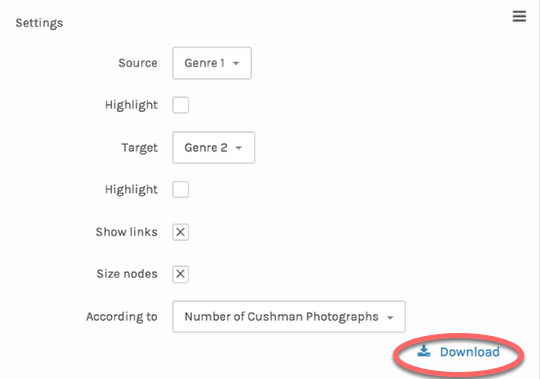
Unfortunately, you can’t embed interactive Palladio diagrams on webpages, but you can produce static images, either by taking a screenshot or clicking on the Download link, which allows you to download an svg file. An svg is an image, and you can post it or share it as you like.
Download your work
Palladio doesn’t save your data, but you can export your data model — the way you configured your data — and upload it again later. This will save you the trouble of configuring your dataset the next time you want to work with it.
To do this, click on Download. This will download a file with the extension .json. The next time you use Palladio, you can upload this file (on the Palladio homepage) in order to open your project where you left off.
Other cool things Palladio can do
Palladio has some other cool capabilities we haven’t discussed here. The image above shows one that I like: the ability to use other georeferenced maps (in this case an old railroad map from the New York Public Library) as basemaps. Here’s a tutorial on how to do that.
Other cool things you can do with Palladio:
- work with multiple tables of data, connected relationally
- export lists of data using the same filtering mechanisms we used for visualizations
- create point-to-point maps
- visualize spans of time with the timespan feature
Finished? Awesome! Now is a good time to see if anyone else in the room needs a hand. While you’re looking for people to help out, see if you can answer the following questions by visualizing the dataset:
- When did Cushman take the most photographs?
- Where did Cushman take the most photographs?
- Can you connect travels or photographs with events in Cushman’s life? You can read about him here.
- When and where did Cushman take photographs of landscape features, like trees, clouds, and the sky?
- When and where did Cushman tend to take photographs of people?
- Can you map Cushman’s travels to a particular road or interstate highway? How would you do this?
- What other information would you need to fully understand this data? How might you obtain that information?
And check out the way in which my undergraduate students used the Cushman dataset as the basis for their final project!