For my first blog post, I chose to reverse engineer Photogrammar, a map-based platform built by a Yale University humanities research team. Photogrammar allows the user to search through photos sanctioned by the United States Farm Security Administration and Office of War information (FSA-OWI), beginning with the Great Depression and ending with World War 2.
These photos offer a snapshot of life during a pivotal time in American history, a time beset by severe poverty and population diaspora. To me, photogrammar offered a more personal view of the Great Depression. For example, a photo taken by Dorothea Lange presented a car full of dust bowl refugees, their faces offering a visual example of the despair of the Great Depression and the farming crisis.
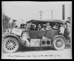
(photo credit: Dorothea Lange)
Navigating through a series of photographs showing slums in San Francisco, abandoned homes in Utah, and marching soldiers in Virginia provided me with a more emotional view of the 30s and 40s, one that a simple text never would.
The Yale research team used the FSA-OWI photos as their main source for the project. From there, the team’s process included scanning the photos into a digital format as well as geocoding the primary sources into a digital map in which users like me can isolate a location in the United States to search for the photos taken in that area. The team used two systems of organization, narrowing the database. One was a hierarchal system previously developed by Paul Vanderbilt in 1942, a method that included categories like “Transportation” and “War.” This system allows readers to view photos associated with one, expanding one’s education of the time period. The second system of classification diversifies the user’s search options, allowing them to isolate photos by their location, date, and photographer.
Part of the team’s presentation includes a large “Start Exploring” button, which directs users to the main map, the core of the project. This illuminates purpose of their project: to provide a clean, interactive format in which users like me (non-historians) can learn about US history in a visually appealing way. The map is aesthetically pleasing, with deep green indicating a wider array of photos to choose from as opposed to the lighter green locations. The map also included a “dots” mode, in which the user can search for photos across the map by photographer. The user can narrow their search by using a timeline at the top of page, isolating photos by not only county and photographer, but by year.
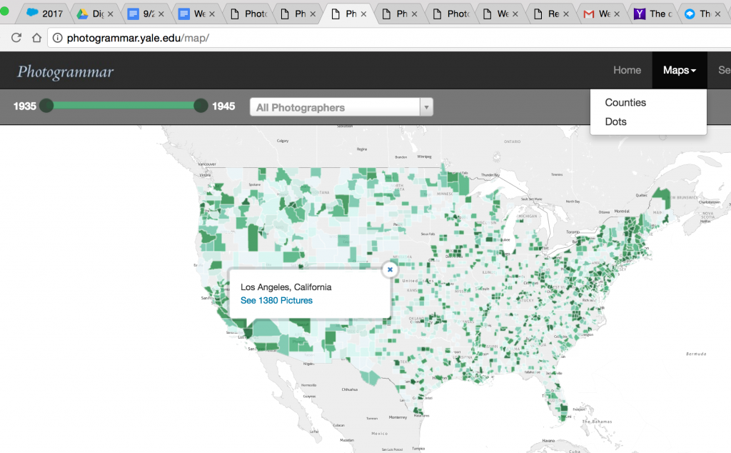
Their map was presented using CARTO and leaflet technology.
I find that the diversity of search options make this project a huge success for users like me who are new to digital humanities. The wide array of search options helps segregate the 170,000 photos; without diverse search options the user could become either overwhelmed or bored. I find the project visually stimulating, informative, and easy to use, a welcome introduction to the world of digital humanities.
