Breach Candy Network Diagram

For this week’s blog post, I decided to visualize the characters in “Breach Candy” by Samantha Subramanian.

screen-shot-2016-11-14-at-1-52-33-pm

I decided to have characters connected together if it is explicitly stated that they know of each other, or if they appear in a scene together.

This network diagram reveals information about the character’s relationships because we can see that in this story, the Narrator and Kunal Kapoor seem to have the most connections. By seeing what people they are connected to, we can get a sense for how big of an impact that character has on the story.

Of course, there is much missing from this network diagram. There is no way to tell exactly what the relationships between these characters are. For example, the Narrator and Kunal Kapoor are friends, but Gerry Shirley and Dipesh Mehta are enemies. There is also no way to understand the trajectory of the narrative or story through this network diagram. It only shows the characters in the story and if they relate to one another, not how they are related or what specific impact they or their relationships have.

Risha Sanikommu


U.S. Causes of Death

death

The dataset I examined recorded death rates in the U.S. by state and by cause of death. I used Tableau to look at the data, and I placed the different causes of death on the y-axis of a bar chart, while putting the number of deaths in the U.S. on the x-axis. This compiles the data in a holistic view, so that the national causes of death can be easily compared.

The chart shows two distinctly high death rate causes: cancer and heart disease. Looking at this data in an excel sheet wouldn’t have warranted an easy extraction of this same information displayed in the chart above. You can also easily find the least frequent causes of death: nephritis and suicide. Seeing this dataset in a bar chart highlights the stark contrast between the two leading causes of death with all the others, creating a very salient understanding of the United States’ causes of death across the nation.

Moma Data Visualization

For our group, we were given the data sets that correspond to MoMa’s collection of artworks. The data includes the artists name, artwork, the age of the artist, the gender of the artists and the nationality of the artist listed. One of our groups main focus points is to explore the relationship between the artists gender and the time period in which they were working. I chose to use Google Fusion Tables to create a data visualization describing this discretion between male and female artists. I used a bar chart to represent this data, showing how there was a total of 1,635.369 female artists working in the 1930’s that are present within the collection. In opposition to a total of 3,612.951 males within the collection.

data-visualization

As you can see by the alluvial graph there is a a large gap between the male artists kept in the collection and the female artists obtained. Not only can we see a disproportionate difference between male and female artists in the collection, but we can see that there is a higher concentration of women artists working in the late 90’s than any other period. Furthermore, we see instances where gender is unclassifiable due to collaboration.

This data visualization allows a more direct visual understanding of the data represented within the spread sheets. We are able to see a physical transition throughout 1943 to 2012 as to the gender of artists collected. With this information we are able to infer our own ideas about what this information can mean. Without a visually intuitive framework, such hypothesis would be difficult to draw.

Data Visualization

I chose to look at data visualizations of “Best City in Florida” from one of the data sets offered using the Google Fusion Tables tool. Based on 20 cities in Florida, the data analyzed several different points of quality of life. The different data points that determined quality of life is based on the factors of income, commute, job growth, physicians, murder rate, rape rate, gold, restaurants, housing, median age, recreation and literacy.

From this data you see 20 cities ranked on these scales, yet they do not have the name of the city so it is difficult to see trends in location within the state. I chose to look at a scatter plot of median age on y axis and job growth on x axis. From this I saw a fairly clustered upward trend that showed the older the average age of the people in the city; the more job growth there is. I find this interesting, as you would assume the younger populations would be in the cities that has a faster job growth rat. The data does not show population size of the cities, but from the visualization of job growth to average population age you can infer that the cities with the younger median age and higher rates of growth will be some of Florida’s biggest cities in the next couple of decades, as there will be more births and job opportunities in these areas from the younger couples.


screen-shot-2016-10-23-at-12-01-14-pm

Another visualization I made to analyze was to look at a Stacked Line graph to compare the safety of neighborhoods with housing price and income. The X-Axis shows the rape rate within the city and the y-axis is in dollars, comparing housing prices and average income in that city. Visually seeing the data was fairly reasonable as the areas with the lowest rape rate had some of the highest house prices, which is what I would expect But, there was one city that had one of the highest rape rates and also the most expensive housing and largest average income. I would assume that this city is one of the bigger cities in Florida as typically rape rates are higher in high density, urban areas.

Comparing the average income and house prices you to see a fairly similar shape in both their trajectories as typically cities with higher housing prices also have higher incomes to be able to afford the housing.

screen-shot-2016-10-23-at-12-01-07-pm

When I just looked at the data it seems that locations where there is a higher income, you would assume you are making more money but my visualization shows that there is a direct relation between housing and income; so even though you are making more, a higher percentage of income will be going towards rent.


Wordle on the NYC Tenements

Creating visualizations are often hard if the data being used is tricky. This is exactly what happened with this week’s blog post. I decided I would attempt to get a head start in our big project by using my data, as it would give me an excuse to really look into the data and make a visualization. My data consisted of about 1100 photographs of New York City Tenements taken by inspectors between the years 1934-1938. The issue with the data is that instead of there being a hyperlink for each photograph, there is a permalink that takes you to the collection website and shows you only that individual photograph (there is no scrolling function on the archive database). Additionally, because the label on all of them are “NYC Tenements” and there are only 5 different year options, I decided to use the notes. The notes, on the other hand, had a lot more information that could actually be used to create a visualization (disclaimer: I am sure I can create better digital representations of my data once we have moved further along in the course).

In the notes, there was information about the picture itself, such as “baby sitting on a bed”, generic information about what the photograph showed, such as “storefront”, and even the address of where the photograph was taken. With this, I copied all of the notes and pasted them onto the Wordle database. While I waited for Wordle to create a “word cloud” of the most common words found in the description notes of over 1100 data entries, I expected to see words like “storefront” or “child” or “st (because of the addresses” be bigger than the rest. Instead, it made me think about a whole other aspect of my data that I had not even considered exploring.

When the cloud arrived, these were the huge words: Manhattan, Brooklyn, and Bronx. That’s when I thought that maybe instead of focusing so much on what was in the picture, I could categorize them according to where in New York the picture was taken. I already had previous knowledge that those were neighborhoods in which immigrants at that time flooded to, and thought that could have something to do with why the photos showed small enclosed spaces with big families, crowded storefronts in building corners, tall buildings with many windows signaling many apartments, etc. Thanks to this word cloud, I was able to see that most of these photographs were taken in 3 specific neighborhoods, where before I was too busy focused on what each photograph contained. Now with this new outlook on my data, I can attack it in a way that is organized and much easier to manage. In other words, Online Visualizations-1 Excel Sheet-0

screen-shot-2016-10-21-at-7-44-47-pm

Week 1 Blog Post Reverse Engineer

For my first post, I chose to reverse engineer MoMa’s “Inventing Abstraction” digital exhibit. This exhibit presents works by acclaimed abstract artist made between 1910 and 1925.

The primary assets of the website is the artwork from MoMA ( Museum of Modern Art), and the 86 artists who are presented on the website. Many people contributed to the design and development of the website which was made possible by by Hanjin Shipping. The Art Institute of Chicago also helped contribute and Acoustguide provided the enjoyment of music on the site. 

Presentation: The home page utilizes an abstract composition, already fitting with the theme of exhibition. While the page is text heavy, it’s important for the user to holistically comprehend the context of the exhibit. Because the web page is based off of visual works, it makes sense that the reader would be asked to process the majority of the page’s text before the artworks are introduced.The connections tab at the bottom allows you to immediately be taken to their most interactive page. 

screen-shot-2016-10-02-at-7-55-10-pm

The visual aspect of the website also makes defining it a unique challenge, but MoMa makes a point to refer to the interactive experience as an exhibition (“This exhibition examines key episodes abstractions inaugural years, exploring it both as a historical idea and an emergent artistic practice”). This language is combined with other stylistic choices that make the site modern, minimal, and sleek–translating the museum experience to a webpage while still maintaining the integrity of the MoMa brand.


screen-shot-2016-10-02-at-7-55-45-pm

The literal map of connections is overwhelming but you can zoom in and out. “Diagram Overview” explains how to interact with the diagram and what it means visually. There is little writing on this page which allows the user to focus on the visual web presented and the artists connections. This is extremely responsive, which is good because your mouse would likely get lost in all of the intersecting lines

Services: By clicking the “artists” link, you can view an alphabetized list of all artists featured in the exhibit. This is useful if someone is looking for one artist in particular, or finds the interactive diagram too confusing. Important artists are highlighted in red to draw attention.

The website has a link that takes you to MoMA’s webpage as well as listen to music while you explore the artwork, giving a more enjoyable user experience. You can view their blog and see a list of programs and events happening at the MoMA in a visual manner.

The actual art pieces can be seen by clicking on an artist’s name first. Once the user clicks on a thumbnail, it becomes clear that the purpose of the site is to present the art. The pieces are presented with the standard MoMa caption, and more iconic pieces, such as Picasso’s Woman with a Mandolin, are accompanied by extensive interpretations.

MoMa’s mission statement is “helping you understand and enjoy the art of our time.” To help users understand the art, MoMa included a “Conversations” page on the website. This page includes commentary from current relevant artists regarding the works in the exhibit. These conversations, in addition to the other features of the site, ultimately serve the purpose of helping the user better understand the art. Putting these resources in a responsive and clean website makes the experience enjoyable to the user, which allows them to focus more on what matters: the art.

Early African American Film- Blog Post #1

Early African American Film Database Interface

After exploring the Digital Humanities projects and their online databases, the Early African American Film option caught my attention the most. It is a collective database created by students at UCLA about African-American silent race films. They narrowed their search to those created before the 1930’s specifically for African American audiences. They gathered their information from a vast array of primary and secondary sources, ranging from archives, collections, written media, and record of actors/actresses themselves. When creating this online archive, their intention was to inform people about a time period in the film industry not many knew about, as well as highlighting special films, actors/actresses and production companies from the business. To do this, they created data visualizations, ranging from excel sheets to diagrams, and even included step-by-steps instructions in case people wanted to replicate their findings.


The database includes both primary sources, such as George P. Johnson’s Negro Film Collection which had production documents from his company, documents related to his brother, who was a black silent film actor at the time, along with magazine and newspaper clippings from the times’ films. They visited museums holding hundreds of films, spoke to scholars knowledgeable about the subject, read books dedicated to films, and looked at other online archives. Their secondary sources included essays about the time, studies on film and race, actor/actress/director profiles, and educational books that studied the history of black people in America, which therefore included their role in silent films.


By taking pictures, scanning items, and taking electronic notes of the data they found helpful to their project, the students were able to place the information onto their online database and into a solely digital environment. From the findings, they created spreadsheets, interactive graphs, and diagrams. They use Airtable to create the database and store a copy onto Zenodo, where scholars can store digital work Thus, this is linked to Github, which allows other people to edit and add onto their information, therefore creating a completely collaborative database. Their data also includes a “digital object identifier”, which makes it possible for people to cite their online archive when using its information.


To present their data, they chose a simple interface, where the headings and drop down tables are well organized and incorporate the main ideas and main subheadings. The photographs used add to the black and white feel of the website, hence black and white films of the time. The graphs, visuals, and screenshots allow you to zoom in, move the cursor for information, view in a larger screen for comfort, or take you to a different page where the diagrams move and become interactive. Overall, this Digital Humanities project is easy to maneuver, enjoyable, and educational!

Week One: Reverse Engineering Photogrammar

For my first blog post, I chose to reverse engineer Photogrammar, a map-based platform built by a Yale University humanities research team. Photogrammar allows the user to search through photos sanctioned by the United States Farm Security Administration and Office of War information (FSA-OWI), beginning with the Great Depression and ending with World War 2.

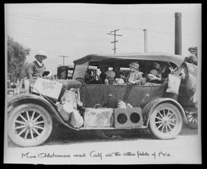
These photos offer a snapshot of life during a pivotal time in American history, a time beset by severe poverty and population diaspora. To me, photogrammar offered a more personal view of the Great Depression. For example, a photo taken by Dorothea Lange presented a car full of dust bowl refugees, their faces offering a visual example of the despair of the Great Depression and the farming crisis.

dust-bowl-refugees

(photo credit: Dorothea Lange)

Navigating through a series of photographs showing slums in San Francisco, abandoned homes in Utah, and marching soldiers in Virginia provided me with a more emotional view of the 30s and 40s, one that a simple text never would.

The Yale research team used the FSA-OWI photos as their main source for the project. From there, the team’s process included scanning the photos into a digital format as well as geocoding the primary sources into a digital map in which users like me can isolate a location in the United States to search for the photos taken in that area. The team used two systems of organization, narrowing the database. One was a hierarchal system previously developed by Paul Vanderbilt in 1942, a method that included categories like “Transportation” and “War.” This system allows readers to view photos associated with one, expanding one’s education of the time period. The second system of classification diversifies the user’s search options, allowing them to isolate photos by their location, date, and photographer.

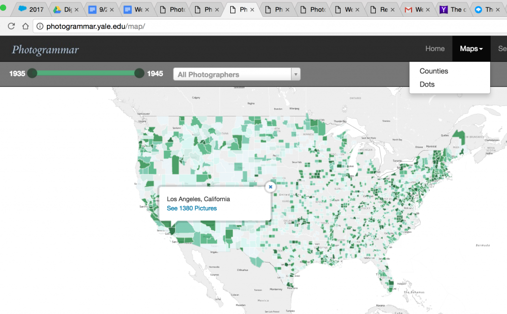
Part of the team’s presentation includes a large “Start Exploring” button, which directs users to the main map, the core of the project. This illuminates purpose of their project: to provide a clean, interactive format in which users like me (non-historians) can learn about US history in a visually appealing way. The map is aesthetically pleasing, with deep green indicating a wider array of photos to choose from as opposed to the lighter green locations. The map also included a “dots” mode, in which the user can search for photos across the map by photographer. The user can narrow their search by using a timeline at the top of page, isolating photos by not only county and photographer, but by year. 

screen-shot-2016-10-01-at-7-45-52-pm

Their map was presented using CARTO and leaflet technology.
I find that the diversity of search options make this project a huge success for users like me who are new to digital humanities. The wide array of search options helps segregate the 170,000 photos; without diverse search options the user could become either overwhelmed or bored.  I find the project visually stimulating, informative, and easy to use, a welcome introduction to the world of digital humanities.

Examining Early African American Film

Initial homepage of the DH Project, Early African American Film, created by Digital Humanities students at UCLA.

I chose to reverse engineer Early African American Film, a DH project and collaborative database that operates by using primary and secondary to
sources to ‘reconstruct’ the silent race film community of the early 20th  century. Race films were created for African-American audiences, aiming to showcase narratives by and for African-Americans. Most of the actual films have been lost or destroyed, and thus evidence of their existence is pulled from newspaper advertisements, posters, and other paraphernalia surrounding the film. Early African American Film works with these evidential primary and secondary sources to create a dataset that showcases Actors, Films, Companies, and their relationships.

This project pulled from a variety of primary sources such as newspaper clippings, posters, and advertisements that were pulled from archives such as the George P. Johnson Negro Film Collection at UCLA. The group chose its own criteria it deemed fit for project inclusion and verified the primary sources via scanned digital copy. It credited other archives such as the Mayme Clayton Library and Museum, The Black Film Archive at Indiana University, Pearl Bowser Collection at the Smithsonian, and Umbra. Secondary sources were also used for the data, utilizing essays, actor profiles, and scholarly works by several different authors that examine race films in depth.

After scanning the primary resources from archives into a digital format and using the secondary sources to further construct the database comprised of the actors, films, and companies that made up the community of race films the project chose to process the data in spreadsheet format. The “relational database” is hosted by Airtable and can be downloaded in CSV (comma-separated value document) format to be opened up in a separate application. The curated database contains the information found in the primary archives and scholarly essays in a table format, including the scanned copies of the film paraphernalia.

This database was then presented to visitors as more of a tool that can be user-manipulated rather than an exhaustive representation of the relationships that made up the race film industry. The table is simple and relatively basic in its presentation; however, the project provided a slew of different tutorials of what researches are able to do with the data at their own leisure. In addition, the project offers a few different visualization tools such as a bar graph showcasing the number of race films produced in a given year and a network graph created on Cytoscape (also included a tutorial on how to create your own).

As a visitor to the database with no prior knowledge about silent race films, I personally enjoyed the page that provided an in-depth explanation as to what race films actually are. I feel as though other DH projects that I have worked with seem to be created for audiences already familiar with the subject, so I enjoyed being able to familiarize myself with the topic before diving in to the data. I found the data to be presented efficiently, although I was a bit overwhelmed by having to constantly be looking to different windows for a tutorial on how to properly work with it. I also personally appreciated their detailed list of sources, especially for this particular blog post, because it was very clear and concise on how their information was retrieved and presented.