Blog Post, Week 8:

I created my network analysis on the characters of the short story, “First Semester” by Rachel B. Glaser and John Maradik, published online October 31st, 2016 in the Granta 136: Legacies of Love. The story focuses primarily on Sarah, who is experiencing her first semester of college and the whirlwinds of friendships, love, and campus legends. The network analysis therefore, is centered around her relationships, based upon conversations or repeated interactions with that person. To create the chart, I had two columns for character name, and the character in relation.

screen-shot-2016-11-13-at-9-01-11-pm

There were many characters involved as the protagonist progresses through her semester in college and this network analysis graph helps illustrate all the connections. The network analysis, however, is limiting because there were many random groups of people she met that I had trouble incorporating into the graph. Additionally, the network treats all the connections equally and it is difficult to gauge how important the characters are too the story.

For example, Sarah has fairly limited interactions with her Mom, Dad, and little brother, particularly in just one scene. However, she has multiple and crucial interactions with Colin and David, who contribute the most to the plot and yet, there are equally represented in the graph.

Blog Post, Week 7

For this week’s blog post, I analyzed the Digital Harlem mapping project, a collaborative research project in efforts to represent everyday life in New York City’s Harlem neighborhood in the years 1915-1930. The information is drawn from legal records, newspapers and other archival and published sources, particularly from the District Attorney’s Closed Case Files, Probation Department Case Files, Newspapers, Committee of Fourteen Papers, and W.P.A. Writers Program Collection. The map included a search function, allowing one to narrow down the results based upon type of event, date, charge/conviction, birthplace and occupation of the participant, race, gender, surname of participant, street, and location type.

It is interesting to note how the project creators claim, “Unlike most studies of Harlem in the early twentieth century, this project focuses not on black artists and the black middle class, but on the lives of ordinary African New Yorkers.” To me, this emphasis on the ordinary, everyday life was not accurately depicted because police arrests and newspapers only depict the out of the ordinary. Rarely do newspapers cover a family eating supper, but rather report on big events or rare circumstances. Similarly, altercations with law enforcement is anything but the norm. Additionally, these records are all based on state ontology and perspectives rather than the community. During a time when racial divides were so heightened, it is likely that those working in powerful positions for the media and law enforcement were not African. Additionally, the map included the option to search by surname since the sources constitute of public records; however, having one’s name in a searchable public record is anything but reflective of ordinary, and everyday life.

Hence, all aspects of this project to me, seemed more like a state ontology rather than a community one. I would change the sources of this map or create a more balanced picture by obtaining interviews from arrestees, family stories and records, jobs and economic activity, plays, music, etc. The more variety of sources, the more accurate the picture can be. As David Turnbull mentioned in his article, maps are always selective and the mapmaker determines what is, and equally importantly, what is not included in the representation. This Digital Harlem map, while a useful tool, provides an inaccurate representation of everyday life in 1915-1930 Harlem. The map reveals only those who have had interactions with law or media entities, and are documented in public record, and obscures the truth by claiming this represents all of Harlem.

Blog Post #4:

For this week’s blog post, I chose to do my data visualization on the topic of my final project- the characters of the DC comics. The dataset provides information on the identities, physical description, and appearances of each other characters. For my visualization, I utilized Google Fusion Table to represent the identities (public vs secret) of the characters, comparing between bad and good characters. Figure 1 represents the identity of the bad characters and Figure 2 displays the identity of the good characters. Immediately, two key things stood out to me from an initial glimpse.

screen-shot-2016-10-23-at-3-14-39-pm

Figure 1: Identities for Bad Characters

screen-shot-2016-10-23-at-3-10-07-pm

Figure 2: Identities for Good Characters

First, I noticed the additional blank bar, which indicated the number with no values. I did not realize how many of the characters on the dataset had missing information and how much it will affect my analysis. Our group has not cleaned our data yet, but now, I realize the crucial decisions and judgments we will have to make on nearly 600 missing identities. This information severely hampers the narrative we would like to tell, such as how more good characters have public identities as opposed to the bad ones.

Second, as I looked to distinguish between bad and good characters, I instantly looked at the pattens by length. As Nathan You, explains in his article, visual cues are one of the key components of data visualizations and is used to make comparisons. He goes on to explain, length is most commonly used in the context of bar charts and the longer the bar, the greater the value. Additionally, he chooses to display an example of a misleading bar graph, where the axis does not start at zero. This exact misconception occurred with me. For the second figure, I immediately deduced the number of public identities to be double the number of secret identities because the bar length looks double in length. It took me a few attempts to figure out that this was because the axis started at 500 rather than 0.

In conclusion, this data visualization made me realize the extent of missing information we have and the rigorous process of data cleaning I must undergo. Additionally, I also realized how misleading some bar graphs may be because my brain immediately deduced a pattern by length, without looking at the numbers first. Graphs can thus be very useful, but also misleading if not careful.  


Blog Post, Week 3

I begin by analyzing the dataset, All City Departments by Payroll, which includes the following data types: Department Title, Year, Job Class Title, Projected Annual Salary, Q1 to Q4 payments, Payments over Base Pay (Including Bonuses and Payouts), % over Base Pay, and Total Payments. There are 56 total records within the dataset, to match the number of departments in City Hall. In understanding the dataset, a few discrepancies and inconsistencies were noted. For instance, they summarize the dataset as “Payroll information for all Los Angeles City Departments since 2013. Data for calendar years, updated on a quarterly basis by the Los Angeles City Controller’s Office.” However, the datasheet only includes information from 2015 and no other year. Next, the category “Job Class Title” seems to be mislabeled. Every other category has a description attached and appears to be self-explanatory. The “Job Class Title” section, on the other hand, consists of numbers rather than any title names. After double checking with the affiliated dataset, “Payroll by Job Class” which utilizes the same category name to describe position names, I concluded the section was mislabeled and instead indicated total number of employees in the department.

After reading through Wallack’s and Srinivasan’s analysis on ontologies, I determine the dataset to be a ‘meta-ontology’ or a state-created information system rather than a community ontology representing local needs. This is apparent by the mission of the collecting agency, City Controller’s Office, along with their choice in categorizations and descriptions used. For instance, they describe the Projected Annual Salary in terms of Budgeted Pay Amount, used for pension contribution calculations indicating the purpose of this dataset is for budgeting and administrative efficiency purposes rather than to represent any community concerns. As a result, there is significant information loss due to the mismatch between this meta-ontology and the community ontology it could have been.

Although this meta-ontology is most useful governing and administrative bodies, the dataset is accompanied by a visualization portraying outcomes that would be of interest to local communities. The chart (as shown below) reveals that the Los Angeles Police Department has the highest payroll expenses. I can imagine various local community groups utilizing this information to further advance their mission or advocate for certain reforms. For example, some groups or public servants may utilize this information on LAPD to highlight how the city prioritizes public safety while other groups may interpret the information as an example of how tax money is being spent on over-surveillance of communities rather than other services, such as health and human services.

screen-shot-2016-10-16-at-8-32-16-pm

However, while this state meta-ontology includes data of interest to the public, there is a huge information loss and does not depict the full picture – allowing for manipulation of data as depicted below. For the information to be of most use, I would expand from the budget and administrative viewpoint in collecting data to one representing community ideals. The current status of the dataset makes it difficult to make any judgments for why payroll in certain departments is significantly higher than others and what this means for individual employees. To counteract this, I would include information such as: average employee salary; largest income discrepancies between employees of the department; demographics of employees including ethnicity, gender, experience and education level; percentage of payroll paid by tax dollars;  and historical trends in payroll expense and number of employees to represent any significant increases or decreases by department. Including such information would make the dataset more relevant to community groups who want to analyze the social and economical outcomes of payroll expenses.

Week 2 Blog Post: George Meyer Simpsons Script Files

The collection presented on writer and producer George Meyer consists of script files for his long-running animated television show, The Simpsons. The script files consist of story notes, outlines, and/or various drafts for seasons two to six of the show dated from 1990 to 2004, as written or co-authored by Meyer.

The container list begins with Censor Notes which provides context and narrative into some of the free speech restrictions and limitations Meyer and his fellow writers had to work around. However, the notes are based from 1989-1996, and many policy and legal changes have occurred since the time, especially due to the dot-com bubble and Internet revolution. To create an effective narrative, these notes would need to be cross analyzed with the scripts both before and after this time frame to discuss any significant changes in content due to censorship.

Next, the Character Design Guide provides animation design guidelines including drawings of characters, situations, objects and logos, along with copyright information. Based on this, one can write an interesting narrative on the number and variety of styles and tools used in creating the animations per category along with whether others can copy the same techniques. However, one cannot conjecture any sort of background as to how these designs were chosen, such as the meaning behind the unique yellow caricatures and who all were involved in this creation (Was Meyer’s?).

The third additional file is the Episode Guide and Storylines reference for seasons 1-9 which includes a general character fact sheet and synopses of each episode along with a character cast list. Since the rest of the script files are focused around Meyer’s time from seasons 2 to 6, this reference guide is particularly important in creating a narrative of how Meyer’s focus for the show was similar or different than the rest. One can point out the general plotline and themes discussed and specific characters introduced or eliminated during seasons 2 to 6, then comparing these to the other seasons not written by Meyer. It’d be interesting to note the transition and change in the plot story throughout the years as different producers and writers are involved. However, in doing so, one will have to look to outside sources to Meyer’s background to understand motivations and inspirations behind Meyer’s plot and character choices as compared to the others.

Lastly, the rest and the bulk of the collection includes the script files, including story notes, outlines, and/or various drafts of scripts for seasons two through six, written or co-authored by Meyer. These files are crucial in creating a narrative highlighting the collaborative and working process of writing a tv show from its first draft to final draft. Story notes and outlines allow a narrator to delve into the authors’ thought process as well as help identify which ideas in particular were by Meyer as opposed to the other collaborators. Additionally, a narrator can mark any significant contributions, tones and themes presented overall throughout the scripts. However, the notes I assume are brief and insufficient evidence to create a full narrative on the motivations and influences behind the plotlines- crucial aspects to consider when evaluating Meyer’s career with the show.

Overall, the collection provided would shape an interesting narrative on the collaborative process of editing and revising along with the details and tools needed in piecing together to create the animations, or presentation. However, the collection provides few solid evidence to build any narrative based on the reasoning or meaning behind the storyline and characters. I found it interesting to note that the script files were organized by alphabetical order as opposed to chronologically by episode. By doing so, I believe the archivists makes the narrator focus more on the contribution of each individual script and overall commonalities in the process rather than allowing for comparisons and connections to be made in the storyline and structure across seasons.

Blog Post #1: Early African American Film

As part of the Digital Humanities 101 course at UCLA, undergraduate and graduate students reconstructed the history of silent race films from 1909-1930, a period often neglected. There exists no clear or consistent definition for the term “race film” amongst scholars, and thus the students discussed the extensive process they undertook to arrive at a suitable definition for their project. For them, a race film was a film with African-American cast members, produced by an independent production company and discussed or advertised as a race film in the African-American press. From there, they create an intuitive and interactive database predominantly containing information on films, actors, and production companies.

Sources:

Although very few of the early race films survived, historians over the last 4o years have painstakingly pieced together evidence from various paraphernalia generated by the industry, including posters, newspapers, advertisements, theater programs, and handwritten notes. As a result, the students’ database drew from a wide range of sources, including 12 primary sources and 15 central secondary sources. Two of the key sources included the George P. Johnson Negro Film Collection, a donation to UCLA containing 71 boxes of material related to African Americans in the US film industry and the Mayme Clayton Library and Museum, which included over two million rare books, films, documents etc chronically the history and culture of African Americans. Historians have meticulously corroborated over the years to create an intensive collection of sources for the students.

Processes:

In compiling the dataset, the students first begin with an extensive process of studying the historical context of race films and then defining it- a crucial step in narrowing or expanding the sources they will work with. From there, they organized their data into a relational database spreadsheet, hosted by Airtable and categorized into People, Films, Companies, and Sources. Additionally, they provide a data dictionary to help navigate through controlled vocabulary used, including field name, data type, and description.

Presentation:

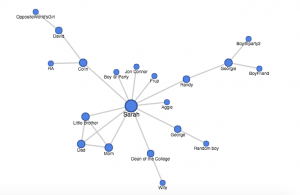
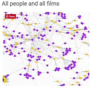
To better display connections across the data, the students create visualizations. Specifically, they utilize plot.ly to create a histogram to demonstrate the peak of race film production in 1921. They created two network graphs representing connections between all people associated with films and one depicting how the people all connected and the films they worked on together. Lastly, they utilized maps to show geographical expansion and locations by year for African American production companies.

screen-shot-2016-10-03-at-10-18-24-am
Overall, I really enjoyed the presentation and display of the students database. The organization and tabs were extremely clear and the content pointed out some interesting new connections and analysis about African American race films- a topic I never particularly was interested in before. I think they did a great job in appealing to the general public and making traditional and complicated scholarship relevant to the average Joe. The dataset the students assembled has been licensed under a CC-BY 4.0 license, which allows the public to work with the data as long as they credited for their work. Additionally, they provided detailed guides on how to download, modify and cite the data and how to best present the data using graphs, maps, and other visualizations.

Link: http://dhbasecamp.humanities.ucla.edu/afamfilm/