For this week’s blog post, I chose to do my data visualization on the topic of my final project- the characters of the DC comics. The dataset provides information on the identities, physical description, and appearances of each other characters. For my visualization, I utilized Google Fusion Table to represent the identities (public vs secret) of the characters, comparing between bad and good characters. Figure 1 represents the identity of the bad characters and Figure 2 displays the identity of the good characters. Immediately, two key things stood out to me from an initial glimpse.
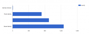
Figure 1: Identities for Bad Characters

Figure 2: Identities for Good Characters
First, I noticed the additional blank bar, which indicated the number with no values. I did not realize how many of the characters on the dataset had missing information and how much it will affect my analysis. Our group has not cleaned our data yet, but now, I realize the crucial decisions and judgments we will have to make on nearly 600 missing identities. This information severely hampers the narrative we would like to tell, such as how more good characters have public identities as opposed to the bad ones.
Second, as I looked to distinguish between bad and good characters, I instantly looked at the pattens by length. As Nathan You, explains in his article, visual cues are one of the key components of data visualizations and is used to make comparisons. He goes on to explain, length is most commonly used in the context of bar charts and the longer the bar, the greater the value. Additionally, he chooses to display an example of a misleading bar graph, where the axis does not start at zero. This exact misconception occurred with me. For the second figure, I immediately deduced the number of public identities to be double the number of secret identities because the bar length looks double in length. It took me a few attempts to figure out that this was because the axis started at 500 rather than 0.
In conclusion, this data visualization made me realize the extent of missing information we have and the rigorous process of data cleaning I must undergo. Additionally, I also realized how misleading some bar graphs may be because my brain immediately deduced a pattern by length, without looking at the numbers first. Graphs can thus be very useful, but also misleading if not careful.
Very nicely and thoughtfully done, Niyati! I think you could even layer the two graphs on top of each other, so that each bar shows percentage good/percentage bad, in the same way we showed how many majors were of each gender in our Excel exercise on Wednesday.
I think what you wrote about also applies to my experience with my dataset! Trying to create a visualization can reveal important data that is missing, as well as how much cleaning needs to be done. While something like a bar graph seems so simple, I now realize how much has to go into data before it is ready to be illustrated clearly.