“Aftermath” by Peregrine Hodson

For my story, the narrator does a great deal of introspection and has very little dialogue with other characters. Given the low number of characters in the story, I decided to include every single character that is mentioned by the narrator, even if it’s merely a single reference.

screen-shot-2016-11-14-at-9-29-00-am

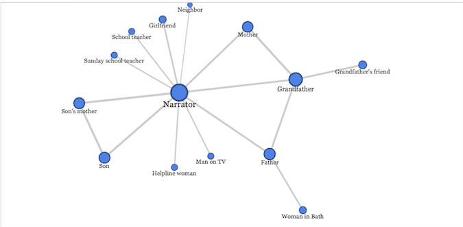
The story focuses around a family with three different generations suffering from PTSD after serving in war: the narrator, the narrator’s father, and the narrator’s grandfather. Interestingly, the network graph shows that the narrator and his grandfather have the most connections, and the father has one less edge than the grandfather, though it appears at first, from reading the story, that the father and the grandfather are given equal weight. Also, for the amount of time the narrator spends discussing his son and his son’s mother in the story, those two characters have no connections other than to the narrator and to each other.

One thing I think is interesting about the connections in this particular story is how they tie in to the subject matter: aside from their immediate families, none of the three men suffering from PTSD have any strong connections to other people. The narrator’s interactions with neighbors, teachers and counselors are shallow and artificial. The grandfather’s friend and the father’s acquaintance in Bath – their only non-familial connections – are both dead. I think this is a telling point about the sense of isolation that occurs with soldiers who return from war with PTSD; none of these three characters seem to fit in easily into civilian life, and their interactions with others are stilted and limited.

ReVilna

ReVilna is a digital humanities project that maps out the location and narrates the events of the Jewish ghetto located in the Lithuanian city of Vilnius during World War II. The map, which is split up into multiple “stories”, includes about two hundred individual points that are geographically tagged on a city map. Each point can be selected and represents a location of historical significance. Because the ghetto was eventually liquidated and very few residents survived, we have a limited amount of information remaining about what life was like in the ghetto during this time period. However, the narratives for each story quote extensively from different records that survived this time period, such as speeches, meeting records and official statements.

screen-shot-2016-11-07-at-11-46-36-am

Since the dots for each story are separate from the other stories, spatial information about the relationships between these dots is more difficult to find when the user doesn’t click on “explore on your own”. For example, the most important centers for activity within the ghettos are obscured because the map is split into separate “stories” and not gathered into a single map. This makes it difficult to see where the greatest concentration of dots would be located when a user is isolating a single narrative story. If a user were to focus on a single story instead of the whole, they would receive a very different perspective on what life in the ghetto was like: reading only the “Art and Culture” story would paint a much more peaceful picture than “Resistance and the FPO,” which is much grimmer and more violent.

The Vilnius map is definitely selective, as Turnbull asserts that all maps are. As the location of the Vilnius ghetto was a specific spot within the city of Vilnius, the map mainly focuses on a very small part of the city as a whole. Because the limits of the ghetto were clearly delineated this isn’t exactly an arbitrary decision on the part of the mapmakers, but it does eliminate some parts of the narrative that may have occurred outside of the ghetto and still influenced the lives of the people living within.

By combining a map with a narrative, the Vilnius map represents the perspective of some demographics more than others, and is, as Turnbull puts it, indexical. This map definitely represents the point of view of a Jewish person residing within the Vilnius ghetto, as most of its narrative concerns the day-to-day life of a ghetto resident. However, there were separate factions within this group of people, such as the Resistance and FPO which frequently came into conflict with the Judenrat, who were community leaders that tried to keep the peace between the ghetto residents and the Germans. The narrative of this map focuses much more on the actions and viewpoints of the Resistance members than it does on the Judenrat, and as such gives us a much greater understanding of the life of an FPO member than the life of a Judenrat member, or a ghetto resident who wasn’t associated with either group. An alternative map might focus more on the doings of a Judenrat member, or might perhaps trace the life events of individual people who resided in the ghetto, and whose actions we have more information about.

Blog Post 4: Data Visualization

I did a data visualization of “Darts,” a data set of a Wall Street Journal experiment that threw a series of darts at random and then compared the results to expert predictions of the stock market, and what the stock market actually did. The goal of the experiment was to see if expert predictions were actually any more accurate than random probability.

https://public.tableau.com/profile/laurel.scott#!/vizhome/Darts_1/Sheet1

screen-shot-2016-10-23-at-3-56-58-pm

With the use of this data, it is much easier to see that neither the darts nor the expert predictions seem to have any correlation to what actually happens in the stock market. While the darts line has more random dramatic jumps here and there, oftentimes the expert opinion line will decrease dramatically at the exact same time that the actual stock market will increase. This stock market seems determined to avoid any of the dramatic increase or decreases that both the darts and the experts are constantly predicting.

It took a surprising amount of time to “clean” the data for this visualization; I had to reformat all of the “date” information into a way that Tableau would recognize it, and aggregate much of the original data into new columns displaying the average values.

Blog Post 3: Gender Breakdown of City Works by Department

The “Gender Breakdown of City Works by Department” data set is a collection of information regarding the proportions of males and females working in different government departments. It also includes other data examining total payroll per department, total male and female salaries compared, average salaries per man and per woman, and the percentage of each department’s payroll that goes to males and females. For each of these categories, the data can be sorted into pie charts, line graphs, tree maps, and other forms of visualization. It is easy to discover, through manipulating the data, how many men versus women are employed overall and by department, and how their total and average salaries compare. A record type in this data set would refer to all of the information compiled from a particular department of city works.

screen-shot-2016-10-16-at-6-56-18-pm

According to the article by Wallack and Srinivasan, the meta-ontology of this data set was created by the city to monitor the hiring demographics of each department according to gender and how their salaries compare, in order to ensure that there aren’t any alarming disparities that might point to gender discrimination. However, this data gives us no context as to the culture within each city department and whether or not that culture impacts the gender ratios and salaries of that department’s employees.

A city policewoman might claim that women who want to be police officers face discrimination (28% women in the police department), while a fireman might claim that men have a difficult time getting hired in safer and more stable departments (finance and city attorney are both majority women) and are instead shunted into departments that are more dangerous, low-paying and labor-intensive (sanitation, fire and building safety are all overwhelmingly male).

From the point of view of a person who is advocating against gender discrimination in the work place, there is a lot of useful data in this data set but also a lot of information that has been left out. The fact that a man’s average salary is higher than a woman’s average salary in very nearly every city department would be concerning to this person, but there are other factors that could be skewing this data. For example, a record that shows one of the greatest disparities between male and female average salaries – the Department of Convention and Tourism Development, with $145,000 for men and $54,000 for women – only has fifteen employees, which suggests that the disparity would be significantly smaller if there were more employees to balance out the data.

For this person, information showing the number of discrimination complaints lodge annually per department would be useful, because that data could then be compared to gender disparity in the departments to see if there is a correlation. Additionally, data showing the proportion of males and females in positions of leadership in departments would be useful, as it might provide more social context.

Blog Post 2 – Glen Keiser Collection of Comic Books, Fantasy Drawings, and Realia

The Glen Keiser Collection is an archive of physical comic books, fantasy drawings, and other memorabilia from the 1940s to the 1980s. It includes comics published by DC, Marvel, and independent publishers. The comics are organized by publisher and then stored alphabetically. In total, there are 68 boxes in the collection, which contain both comics that are very famous and well-known today and comics that are extremely obscure. Other items in the collection include books about comics, mounted art, comic strip books, and other comic-related memorabilia such as T-shirts and cards. The finding aid for the collection gives details about the collection’s contents and time span, and lists every comic title in the collection according to which box they are stored in.

2016-10-09-2

Comic books often mirror or discuss relevant social issues of the time they are published, such as wars, social and political unrest, race issues, and other current events. It is likely that reading these comics would provide some historical context for what people were feeling and thinking about during these time periods. It wouldn’t be explicitly stated, but by being able to read between the lines, media from historical time periods can be very illuminating when trying to understand a historical narrative.

However, this narrative would be told entirely from the perspective of the comic writers. It can be assumed that their opinions will be representative of at least a fraction of society at the time, but there will be many historical perspectives that won’t be represented – especially during time periods where women and ethnic minorities probably weren’t hired to write for major comic industries such as DC and Marvel (the 1940’s and 50’s at the very least).

The collection does include some independent comics that weren’t published by DC or Marvel. It is possible that some of these comics were  written by people who might provide very different perspectives from the mainstream, which would help to remedy a myopic historical narrative. If not, it might be worthwhile to incorporate into this collection comics that were explicitly written by people excluded from the mainstream narrative in order to provide different perspective. By including these kinds of comics from the same time period as the mainstream comics, it would be easier to piece together a historical narrative that would be much more true-to-life, and provide more than one viewpoint on historical events and cultural shifts.

Blog Post 1 – Photogrammar

The Photogrammar website is a Digital Humanities data visualization project that organizes FSA-OWI (Farm Security Administration and Office of War Information) photographs from 1935 to 1945, and plots them on a map of the United States. The photographs are organized geographically but can also be organized by photographer, date and subject matter by the user.

Photogrammar map by counties

The creators of Photogrammar used the photographs that were taken during this time period as their primary sources, and were able to access them because the various photo collections are maintained and catalogued by the Library of Congress. The FSA-OWI photos were taken to document the resettlement and relief programs, specifically for farmers across the United States, that began during the Great Depression.

The Library of Congress stored the photographs with their original Lot Number system and Classification tags, which the Photogrammar team incorporated into their website, allowing users to search for photos taken by specific photographers, on specific dates, or during specific photo shoots. Therefore, the primary sources for this project include both the photographs themselves and the original data used to organize and classify the photos.

As part of the processing of this project, the photographs were already digitized by the Library of Congress. The Photogrammar team members quantified how many photos were taken in each county of the United States so that information could be represented visually on the map. Organizing the photos depended entirely upon their lot numbers and classification tags, so that the photos could be sorted in a variety of different ways on the website: by date, by location, by subject matter, by photographer, or by photo shoot.

In presentation, the team created two different interactive maps: one that presents the United States counties and uses color gradients to signify how many photos were taken in each county, and one that uses colored dots to indicate photo shoots taken by different photographers. In both cases, the user can click on a county or a colored dot to view the photos, which are organized chronologically and display the time frame for that particular set of photos. Users can also limit the data on the map by restricting the time frame or only viewing the dots for a specific photographer. Aside from the maps, the website includes an advanced search function that enables users to search for more specific photographs or collections. Additionally, the website has a “Labs” page for data experiments to interpret the FSA-OWI photographs, including a three-tier treemap and a metadata dashboard – only for California – that displays data from the photographs through a pie chart and bar graphs.