This week I chose the dataset of death rates in the US for visualization and analyses because it offers statistic evidence to a unique topic, the culture of death in the US. The original data types were categorized by state. One data record includes several common causes of deaths and some related demographic information. First several reasons for deaths are crucial illnesses such as heart, cancer, stroke and respiration. Then there are deaths by other diseases including diabetes, alzheim, flu, nephritis, and aids. Then the spreadsheet shows the deaths by external forces such as suicide, homicide, accidents, etc. Although the original data are relatively clean a few data were marked as “null.” There are other problems with the original dataset too. Some data which are supposed to be whole numbers but they appear decimal. Also we don’t know which year or years those data were collected. Without any footnotes or other types of additional interpretations, we can only assume those data within the dataset represent information from the same historical periods and form certain comparable relationships among themselves.
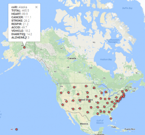
My first visualization was to geocode the data with Google fusion. The fifty states follow the alphabetical order in the spreadsheet so it was easy to notice Alaska but difficult to see data from Wyoming. We need to adjust the display to read a whole record too since it is rather long. For researchers, they usually need information from one or only a few states. This map uses dots to show the states within the same space. It breaks the original restriction of ordering in the original spreadsheet and offers all the record at once. To read a whole record one only need to point the mouse to the dot representing the state he or she intends to do research on. In this way, the map reorganizes the data and saves the researchers’ time.
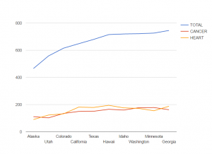
Then I visualize the comparisons of total deaths, deaths caused by cancers and by heart diseases between the ten states. Due to the large quantity of the deaths caused by cancers and heart diseases in any record in the spreadsheet is clear that cancers and heart diseases are two cruelest killers for humans in the States. But we do not really know the percentages of those deaths in the total deaths or comparisons between those biggest killers in the ten states because the spreadsheet cannot contain all the calculated information. This chart shows that generally speaking, neither cancers nor heart diseases constitutes even one third of the deaths in those states. So there are many other deaths responsible for the perishing of human lives. For some states like, Alaska and Minnesota, there are more people who died of cancers than of heart diseases. But for the states such as California, more people of heart diseases died. This chart is very useful in terms of studying how different public policies or local living habits in different states play a role in determining people’s deaths.
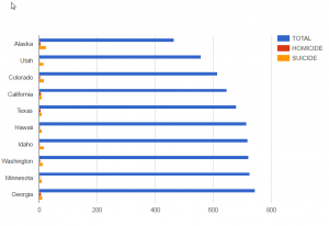
This third chart shows the ratios of total deaths, homicides, suicides in the same ten states. Because the original excel does not offer the percentage of any type of deaths in the total deaths, it is difficult to know how the data manifest different death cultures in different states. This bar chart at least shows how human’s willpower shapes different deaths in the chosen states. For example, Alaska has less total population than the other ten states but the bar of the total suicides is longer than that of any other nine state. It could indicate that Alaska people are more likely to feel depressed or desperate perhaps because of the financial difficulties, harsh weather or long nights in winter. The total population of Hawaii and Idaho don’t differ much but people in Idaho are more likely to commit suicides. For most of the states in the chart, the ratio of suicides to homicides is high but only in California and Georgia homicides and suicides are almost of the same length. So in those two states, the law enforcement should pay more attention to crimes to protect our safety.
Nice analysis, Baoli. I appreciate that you tried out a few different modes of visualization before settling on one that helped you understand your data.
I thoroughly enjoyed your post. I like how you first introduced the project, then went on to explain why the table form was bad. You also went through the process of changing it from table to visualizations, making it easy to understand what you did. I also like the fact that you’ve included a few different data visualization to shed some lights on the unknown from the original data.
Great blog post! I really enjoyed reading it. I knew based on what I’ve learned in health classes that obesity related deaths are the most common in US. However, it is different to see it on a data visualization. I wasn’t aware that cancer is related to so many deaths. Also, I enjoyed your explanation on why there may be more suicides in Alaska. I will agree with you that long winters, weather, may be the culprit.
All of you graphs were great visually as the scales were reasonable and had a good balance throughout the graph. I liked how you gave three different visuals for us to look at the data from a couple different angles. It looks like you are very proficient in making graphs!
Great post! This kind of visualization is really helpful in trying to identify environmental issues that may cause some of these diseases, such as chemicals that may cause cancer or other geographical health risks that may contribute. It is also helpful in understanding why suicide or homicide are more prominent in some areas then in others.
Dear Baoli,
Your use of multiple graphs helped me to understand the difference between accurate and misleading data visualization. In particular, your bar graph which compared suicide, homicide, and total death rates across different states in America helped me to notice how small suicide and homicide really are in comparison to other causes of death. It almost made me want you to directly compare only suicide and homicides, as that would create a more “full and balanced” graph, of which I am used to seeing in many studies. Only with your visualization did I realize how misleading it is to redact overall average numbers in data, for the sake of illustrating an narrowed argument with an agenda.
I really liked your use of multiple types of graphs and your analysis on different states’ death rates! The data set had a lot that you could do with it, but it is interesting to see the different ways in which you consumed and altered the data in your own way.