My blog for this week features the visualization of “NYC Tenement Photographs“. The dataset includes photographs taken by inspectors of the New York city tenement house department from year 1934 to 1938. Although there are as many as 1102 photos in collection, only 6 data types are present. This obviously leads to difficulty in both finding information about each photo and classifying by vague attributes. For example, the last datatype was “Title”, which is a combination of the name of the building in the photo and its corresponding address; some of the photos do not even have an address attached. Also, the photo urls in this dataset direct to the webpage that displays the photo, instead of the photo itself.  After looking into the coding system of digital collections at the New York Public Library, I discovered most of the true urls of the photos which unfortunately, still fail to display on Google Fusion Tables. Thus, the first tool that I utilized was Wordle , a website that creates word clouds according to the frequency of words used in the selected text. By entering the Title data, I was able to create this word cloud. It indeed tells some of the essential and most frequently used information, such as the heavily populated area (Manhattan) and the most common type of the buildings (storefronts). However, I still want a more clear and direct visualization.

I filtered out all of the photos with a building address by using OpenRefine. It resulted in 416 effective items, which I used Tableau to split the building type from the Title section, leaving lines of address alone in a new row. By optimizing the dataset, I was able to map the locations of photos. 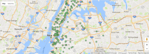 And I think it provides a better visualization of the geographical distribution of NYC Tenements.
That was an ingenious use of Open Refine, Leo! I wonder if you can share your workflow with your labmates. You must have had to get a little creative!
Really nice cleaning of data and use of the visualization tools! I am also working on this dataset, and it really takes me a while to realize how to separate the addresses out from the title column. Really nice presentation of the addresses using the geographical visualization within Tableau!
I like you use of Wordle to create a word cloud – it’s a unique way of displaying data that accompanies the map visualization well. Props to you for being able to identify difficulties with the data and working towards finding a solution.
Wow, great job using the tools we learned from discussion and class just a few days ago very effectively. I really like the use of Wordl as well. I also appreciate the extent you went to clean your dataset and your explanation of your thought process.
Great job with really digging deep to truly understand your dataset! I liked how you displayed your thought process on how you progressed from using Wordl towards using OpenRefine and then Tableau. The map visualization seems especially interesting since you can see the really big disparity between Manhattan island and the rest of New York.