 Inventing Abstraction, 1910–1925 celebrates the centennial of Abstract Art as an interactive website accompanying a MoMA exhibition of the same title. Although the physical exhibition was only available from December 23, 2012 to April 15, 2013, the online display continues to educate viewers on the origins of abstraction. By demonstrating the emergence of abstraction in the form of a network connecting modern artists across countries and media, the exhibition relates to the most influential works in the early stage of abstraction in a broad range.
Sources:
 Organized by Leah Dickerman, Curator, with Masha Chlenova, Curatorial Assistant, Department of Painting and Sculpture, the exhibition includes paintings, drawings, books, sculptures, films, photographs, sound poems, atonal music, and non-narrative dance to draw a cross-media portrait of early abstraction. The curators selected works of 92 artists who were active during year 1910 to 1925, and created a spreadsheet consisting the information of all of the aforementioned artists to determine the representative works and social networks on display. The selected artworks were photographed, scanned, transcribed, recorded, restored, shipped, and installed to integrate into the exhibition. It is revolutionary that wide ranging sources, including early dance films and recordings of poetry and music, are brought into the galleries of early abstraction. The unprecedented collection of American vanguard art works is also groundbreaking to witness.
Processes:

The process of the exhibition was achieved via MoMA staff’ creation (including the curatorial and design team ), as well as the support from the Columbia University Software and Second Story.
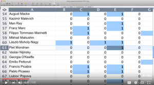
On the one hand, the The Artist Network Diagram was a significant component of both the interactive interface in the website exhibition and the outline of the physical exhibition. Its creation started from curators collecting the literal description of selected artists and their relationship. Scholars in the Columbia University then constructed a digital dot-graph based on the original chart. Furthermore, graphic designers sorted out a visually organic improvement on the graph. It was the 1936 MoMA exhibition Cubism and Abstract Art and the now-legendary diagram on the cover of its catalog that offered inspiration. Designers incorporated the Alfred chart (Alfred H. Barr, Jr, the founding director of the MoMA) with the concept of social network. Thus, a comprehensive network graph of early abstraction artists was made.
Second Story, on the other hand, contributed to the process by coding the sources and data into the network frame. Creating an interactive diagram which enables the viewer to compare, relate and learn the artist information, artwork and conversations, the tech team utilized their mastery in programming to make the virtual exhibition possible.
Presentations:
 Inventing Abstraction, 1910–1925 offers a multimedia visualization of the origins of abstraction. Suggested in a diagram, the spread of abstraction is about relationships and collective participation. The website presents a dynamic, 3D diagram of the connections between the artists, so that as visitors interact with the diagram, they can explore detailed networks, view artist portfolios, and draw their own conclusions about influence, impact, and invention.
 The home page offers a brief introduction of the exhibition theme and the diagram to the viewers. By clicking Explore Connections, the viewer will enter the most essential part of the website – connections in between the artists. On the left and right side of the website, there are two virtual buttons available for control: return to the previous page and a changeable scale. Such designs facilitate users’ experience when switching from different connections. There are two navigation bars at the top and bottom. The primary navigation includes links to Connections, Artists, Conversations, and Programs & Events, while the secondary navigation leads to About the Exhibition, Network Diagram, Checklist, Publication, Music, Blog, Credits and MoMA.
Clicking the “Artists” link offers viewers an alphabetized list of featured artists, with the essential ones highlighted in red. Clicking on an artist’s portfolio enables viewers to examine detailed information about the artists and his/her artwork.

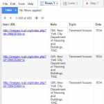 After looking into the coding system of digital collections at the New York Public Library, I discovered most of the true urls of the photos which unfortunately, still fail to display on Google Fusion Tables. Thus, the first tool that I utilized was
 And I think it provides a better visualization of the geographical distribution of NYC Tenements.
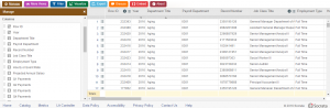 Row ID, Year, Department, Title, Payroll Department, Record Number, Job Class Title, Employment Type, Hourly or Event Rate, Projected Annual Salary, Q1 Payments, Q2 Payments, Q3 Payments, Q4 Payments, Payments Over Base Pay, % Over Base Pay, Total Payments, Base Pay, Permanent Bonus Pay, Longevity Bonus Pay, Temporary Bonus Pay, Lump Sum Pay, Overtime Pay, Other Pay & Adjustments, Other Pay (Payroll Explorer), MOU, MOU Title, FMS Department, Job Class, Pay Grade, Average Health Cost, Average Dental Cost, Average Basic Life, Average Benefit Cost, Benefits Plan and Job Class Link. While there are 285008 rows stored, a record in this specific dataset refers to the aforementioned profile of a department in the city.