This week I looked at the Pollution dataset that contains the air quality measurements on 41 U.S. cities, and this data is from “A Handbook of Small Data Sets”. For each city there is information on their SO2 levels, sulfur dioxide (a toxic gas in the atmosphere), population, temperature, wind, precipitation-in, and precipitation-day. I chose to focus on the SO2 levels, the population, and average temperature in the first 12 cities based on population.
I used the Google Fusion Table to see the map of the city locations. As you can see, this visualization tool allows one to see the heat map of the city indicating the strength of the SO2 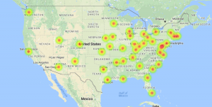 and temperature. The map allows the data to be visualized for an easier time identifying which cities were studied and where the SO2 and population levels are highest.
To get a more accurate, slightly less visual, idea of the data, I have the top 12 cities based on population (starting from lowest population). The blue line indicates the population, the red line measures the SO2 levels in that city, and the orange line indicates the average temperature. Although there are other variables in this dataset, I chose these particular variables to see if there was a causation of SO2 levels from increasingly populated cities. This data visualization answers this for us is 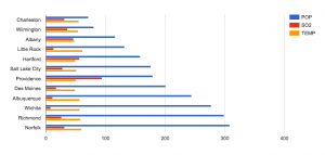 that the cities with higher populations does not necessarily have higher SO2 levels. I also included the temperature variable to show a data that is nearly stable throughout the whole data set. Ultimately we can see that having a large population is not direct causation of high SO2 levels. As a result, we raise more questions as to whether the SO2 levels has an effect on any changes of temperature, which we can find out if we compare and contrast this data with previous years’.
When I first set out to do this simple data visualization, I was expecting to see at least a correlation with high population and high SO2 levels. Of course, some cities like Chicago have high population and SO2 levels, but this is not the general trend. In order to determine the cause of SO2 levels, there needs to be much more data available to include as a variable. For example, state regulation on SO2 production may vary from state to state (it is used in winemaking, as a preservative, reducing agent, etc.)
In the end, it was great to use a simple visualization tool like Google Fusion Table to quickly see data in a map and chart. One can immediately start asking questions and notice major points from the data. Used more extensively, and in an advance visualization tool, one can definitely answer more difficult questions about the atmosphere in U.S. cities.
I really liked how you first represented your data in a map. The heat map really helps us visualize the extent of the pollution, as compared to just the areas. Then I like how you presented a bar graph to give the user further insight if they would like to explore details of the data. Overall, a very well done post!