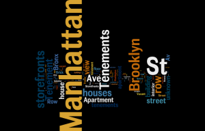
I used the data set that my group was given for this blog post. I believed that by doing this, I would better familiarize myself with the data set and it would allow for a better understanding of how to work with the data itself. Due to the data set of the New York tenements, the options for data visualization were very limited as the data types consisted of static records, for the most part, when it came to the categorization of dates assigned to the photographs, which volume the images are collected in, where the image came from. The variables within the record set were the description of the item and the URL link to the image itself. I uploaded the data into a Fusion Table first and found that the visualization was messy and did not allow for a deeper understanding of the values. After uploading the data to Tableau, Palladio, Plotly, and RAW with no success, I uploaded that data to Wordly, which actually did work. I only used the “description” column of the data set which contained the locations of the photographs. From here I learned that the largest concentrations of photographs were taken in Manhattan and Brooklyn. This is very important to know because I may be able to adjust my research question to better reflect these two specific cities in New York. Seeing the visualizations of location really helped me to understand where each photograph was taken and I can now consider how to compose a humanities research question based on location. In order to work further with the data, it is very important to clean the data table itself especially in the “description” column. It would be very useful to split the information provided in terms of city (Manhattan, Brooklyn, Bronx), specific types of housing (row houses, apartments, tenements) and if it’s either labeled as a interior or exterior image.
I understand your dilemma- I had a difficult dataset to work with myself because it didn’t contain any numbers, but mostly words. I really appreciate how you documented all your trial and errors- DataViz is full of trial and error, and it is really hard to determine which platform to use. I loved your Wordly map. It is super informative, and it helps us determine where most of the photographs are from. This shows me that location is a huge aspect of your data set, and that your project will feature a map pertaining to location of the tenements.
I know, this is a tough dataset. I think Wordle was a smart choice for this visualization. I do feel that for your project, you’ll probably have to look at each image individually and supply additional metadata for it, depending on what you’re interested in (e.g., “family,” “exterior,” “interior”). Let’s definitely talk if you think it would be helpful.