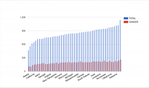
While I thought many of the data sets were interesting, the one that stuck out to me the most was the set on Death Rates. It provided a look at death by various means such as heart failure, cancer, stroke, suicide, homicide, and more. The points of data are categorized by death type and by which of the 50 states the death took place in.
Though the excel sheet is labeled “Death Rates” it is unclear how exactly it is measured. It is clearly not a percentage since all the states have numbers over 100. Could it be a certain number of people within a population? Is it the number of overall deaths within a certain timeframe? Is it the number of people within certain regions of the state? Is it the number of people in an age group? More clarification would be significantly helpful.
While we do not have some of the context, the main extrapolation that can be made from this data is which of these causes of death affects the most people. I thought it would be interesting to see how much cancer plays a role in total deaths. To my surprise, it seems like cancer is, for the most part, pretty evenly distributed throughout the country. Though there are notably fewer cases in Alaska and Utah. What factors here led to fewer cases of cancer? Other things to take into consideration is that though there are fewer cases in these states, they make up a greater portion of the total deaths.
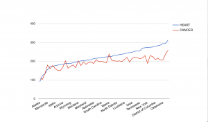
Another comparison that I thought would be interesting is the rates of death by heart failure compared to death by cancer. These are both common ailments, and this visualization helped to show what happens in each state. Cancer surpassed heart disease in Alaska, Colorado, Minnesota, Washington, Oregon, Montana, and Maine. I would like to know what factors, if any, led to the prevalence of cancer in these states. Could it be that there are factors that lead people to develop cancer here, or is it just sheer bad luck?
The data set was really interesting and provided a look at various diseases across the fifty states. This data was good for trends, but more context would be greatly beneficial, and allow for a more accurate understanding of what is happening in each state.
Great post! I had a similar issue with my data in that the units of measurement were not included, but I like how you analyzed this problem. I am wondering if the units were excluded because the data would not be processed as numbers if letters accompanied them, though I still think the units could have been included in the title of each column without affecting the data.
It is interesting that cancer rates seem to vary so much for each state, whereas heart failure rates seem to follow a steady upward trend across many states. This leads me to think that environmental factors in each state may affect cancer rates (maybe there are fewer carcinogens in Alaska because it is so far from urban centers?), whereas heart failure rates seem less dependent on environment. However, as you point out, this is all conjecture because of the lack of metadata. These cancer rates could just as easily be bad luck, as far as we know.
Your analysis was very thorough in that you considered several different angles to the dataset and how missing information could contribute to understanding the source. It was a bit confusing as to which states were affected by cancer, as not all 50 were listed in either graph – also maybe you could incorporate other reasons of death besides cancer such as heart failure, stroke, suicide, homicide into a pie graph. Although the numbers in the dataset don’t add up to a numerical value of 100, the graph would still gather these numbers and split it by section to add up to 100%.
I really enjoyed looking at your graphs. You chose to examine specific but intriguing aspects of the dataset and I feel like your analysis would be helpful to someone studying cancer or heart failure, or both. However I do agree with Crystal that not having all 50 states on the chart makes it slightly confusing and could probably have been clarified better.
Dear Dillsl,
I agree with the above comments that labeling your graphs on the x and y axis would make your data vis much more legible. In light of that suggestion, I think your direct comparison of heart disease and cancer deaths is enlightening, inasmuch that the steady growth of heart-related deaths is much more consistent than the small ups and downs of cancer. However, it seems as though only heart-related deaths have been organized by increasing value, where as cancer deaths have not been organized in that way (hence the ups and downs) This information might be more clear if both variables were organized by the same chronological system.