Week 8 – Network Analysis: First Semester

For this week, I decided to create a network graph for First Semester by Rachel B. Glaser and John Maradik.

screen-shot-2016-11-14-at-12-21-24-pmscreen-shot-2016-11-14-at-12-05-47-pm


The story follows Sarah’s first semester in college. She is a premed student who has to go through the hardships of fitting in and adjusting to this new chapter in her life. The graph indicates a connection everytime Sarah has an interaction with someone. Throughout the story, she interacts with multiple groups of people such as her premed friends, her family, her friend Georgie, and more.

The story takes some interesting turns, and if I were to redo this chart, I would probably add weights to the links by making them heavier or making the nodes bigger by number of interactions. While Sarah’s node is the biggest, it is due to the number of interactions she has had as a whole, not by individual.

She has had significantly more interactions with Georgie, Colin, and David, but this can’t be seen through the graph. In addition to this, some of the narrative was unclear. An example of this was Georgie’s friend at the party. Was this the person that Georgie was holding hands with, or was it someone new? These things would be helpful when constructing a graph.

Week 7 – Digital Harlem

This week I decided to look at Digital Harlem: Everyday Life 1915-1930. This is a map that describes itself as a visualization of New York City’s Harlem neighborhood in the years 1915 – 1930. The information presented is compiled from various legal records, newspapers, and other archival and published sources. When first interacting with the project, a welcome blurb is displayed as well as a search bar to the left, a map in the center, and predetermined search filters on the right.

In the search filters to the left, the field “charge/conviction” immediately stuck out to me. I think this conveys a very specific narrative to new users of this project. It puts a very crime centric spin on the project and it makes it an integral part of the search. In addition to this, the majority of the events in the predetermined search filters on the right showcase arrests and crimes. While I do not think there is a problem with this type of visualization, I think there is an inherent problem with the name of the project. This could be useful information for some people, but to label it as “Everyday Life” is painting the community in a bad light. Yes, there are meetings and public events highlighted, but these are significantly outweighed by the number of crimes presented.

The project provides additional insights through its sources as well as additional maps in the “featured” section. The source section adds contexts to the events on the map, and also say that the crimes are not necessarily representative of hardened criminals. While this may be true, it still presents the surface level visualization of crime. Some users may not delve deeper than the map, and won’t understand the context behind it. To carry the name of “Everyday Life” I think it’s important to include so much more information. Who lived in what communities? What businesses and restaurants were on each block? What did some of these blocks look like? What was the average week for these citizens? To have this static map where people are presented solely by their crime or transgression is not only a disservice to them, but to Harlem as a whole.

This map displays a particular narrative, and is quite selective in its subject material. I would be curious to hear from the creators of this project why they decided to label the project as everyday life and if they had considered any other times. There were some other interesting maps in the featured section such as Harlem’s Hospitals, Harlem & Baseball in the 1920s, and more. I think even these would have been better at showcasing everyday life than the default featured maps on the right.

Week 5 – Death Rates

While I thought many of the data sets were interesting, the one that stuck out to me the most was the set on Death Rates. It provided a look at death by various means such as heart failure, cancer, stroke, suicide, homicide, and more. The points of data are categorized by death type and by which of the 50 states the death took place in.

Though the excel sheet is labeled “Death Rates” it is unclear how exactly it is measured. It is clearly not a percentage since all the states have numbers over 100. Could it be a certain number of people within a population? Is it the number of overall deaths within a certain timeframe? Is it the number of people within certain regions of the state? Is it the number of people in an age group? More clarification would be significantly helpful.

While we do not have some of the context, the main extrapolation that can be made from this data is which of these causes of death affects the most people. I thought it would be interesting to see how much cancer plays a role in total deaths. To my surprise, it seems like cancer is, for the most part, pretty evenly distributed throughout the country. Though there are notably fewer cases in Alaska and Utah. What factors here led to fewer cases of cancer? Other things to take into consideration is that though there are fewer cases in these states, they make up a greater portion of the total deaths.

screen-shot-2016-10-24-at-11-13-52-pm

Another comparison that I thought would be interesting is the rates of death by heart failure compared to death by cancer. These are both common ailments, and this visualization helped to show what happens in each state. Cancer surpassed heart disease in Alaska, Colorado, Minnesota, Washington, Oregon, Montana, and Maine. I would like to know what factors, if any, led to the prevalence of cancer in these states. Could it be that there are factors that lead people to develop cancer here, or is it just sheer bad luck?

screen-shot-2016-10-24-at-11-21-53-pm

The data set was really interesting and provided a look at various diseases across the fifty states. This data was good for trends, but more context would be greatly beneficial, and allow for a more accurate understanding of what is happening in each state.

Week 4 – Top City Earners

I thought the Top City Earners dataset from the L.A. Controller’s Office would be an interesting set to dive into. This dataset showcases the top salaries for Los Angeles city workers. These salaries are comprised of various factors such as base pay, overtime pay, other pay, and more.

The various data types are the occupations, and the amounts of money they are paid. These monetary values are also broken down into sections. These pieces of data comprise a record with occupation title and total pay. Wallack and Srinivasan describe ontologies as, “systems of categories and their interrelations by which groups order and manage information about the people, places, things, and events around them.” The ontology can be seen in the records for each occupation. The various categories data types add up to make total salaries. But when looking at each position, the data types combine in different ways. For instance, when looking at purely base pay, the Chief of Police and the General Manager & Chief Engineer of Water and Power earn the most. However, when factoring things such as bonus pay and overtime pay, the positions at the port earn the most. Another thing that is quite interesting is that firefighters seem to make the lowest base pay. Often, their overtime pay is double that of their base pay. Why is this the case?

screen-shot-2016-10-17-at-11-41-22-amSome people that may find this data useful are city officials who are in charge of the budget, and also taxpayers. City officials can see how much of the budget is going to what positions and how they affect the city as a whole. Taxpayers can see where some of their tax dollars are going, and how the city of LA is paying its workers. I would imagine people would wonder why some positions get so much bonus pay. The job descriptions and years of experience are missing from the data set. This would help to differentiate the positions and give context as to why they are being paid so much. This also helps in comparison. For instance, why does a port pilot make significantly more than firefighters or police officers?

When approaching this data again, it would be interesting to divide the records by job types such as firefighters, police officers, and port pilots. It would be interesting to see the pay distribution in the individual categories.

Week 2 – Walt Disney Productions Publicity Ephemera, 1938-198x

I thought the finding aid, Walt Disney Productions Publicity Ephemera, 1938-198x, would be interesting to delve into. The finding aid initially lists background information such as the creator, dates, location, and extent of the collection. It also talks about how to access it. In this case, advance notice is required. The collection includes printed publicity materials for Walt Disney Productions films. Among these printed items are press kits, press books, publicity stills, and more. The collection hosts more than 150 titles and includes films such as The Jungle Book, Mary Poppins, Davy Crockett, and more. The aid also has a biography on the Walt Disney Company. The biography describes the beginnings of the company with Steamboat Willie all the way through the leadership changes, and what Disney has become today.

The contents of the boxes are listed in alphabetical order. While this is a good way of keeping information organized, I do not think narratives can be constructed when organized in this manner. I feel that sorting the works chronologically would provide a greater framework. Once the works are organized by date, they can be sorted through more filters. Some examples are when new technologies are implemented such as the use of color, sound, or computers. Some other questions could be posed. When did Disney transition from hand drawn animation? Were there stylistic and tone changes in content when Walt Disney died? Did the executive power struggle affect Disney’s creative process? Were Disney films affected by other factors such as trends in the movie industry? These questions may not necessarily all be able to be answered from the materials, but they will be a good starting point. Placing them into chronological order will let us see changes over time, and we can search deeper through other library and online resources.

Week 1 – Inventing Abstraction, 1910-1925

Week 1 – Inventing Abstraction

Inventing Abstration, 1910-1925 is an online visualization that accompanies a physical exhibit at the New York Museum of Modern Art. It was displayed at the MOMA from December 23, 2012 to April 15, 2013. The exhibit aimed to capture and understand the beginnings of the abstract art movement. Included in the exhibit were paintings, drawings, books, sculptures, films, photographs, sound poems, atonal music, and non-narrative dance.

picture1

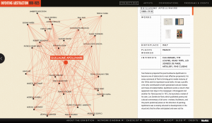
Another purpose of the exhibit was to see how the abstract art movement was able to move so quickly between regions and artists. I thought this visual representation was a great way of doing that. The visualization displayed artists as nodes and they connected to other nodes if they had verifiable interaction.

Credit is given to Second Story for the design and development of the project. As stated previously, the exhibit brought together art of many different formats as sources. These art works are then digitized via photographs and scans. Once these works have been processed, they are matched with the respective artists. In terms of the nodes and links, the visualization looks like it was made in the program, Gephi. To construct these visual networks, points of data are inputted into an excel sheet and exported as a csv file. In the excel sheet are most likely categories such as “connections” or “art work.” This allows the artists to be connected via the links.

The network map allows users to click around the various nodes. When a node is clicked, the screen zooms in to the specific node and every node that is connected. This creates a smaller network within the overall network. From here, users can see which artists are associated with one another. In addition to this, this screen shows more details of artists such as their works, birthplace, interests, and more. The zoomed in networks are also a component of Gephi, but additional software was most likely used to add in the descriptions on the side.

screen-shot-2016-10-03-at-11-19-09-am

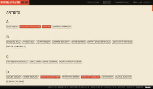
As with many network visualizations, it can be a bit overwhelming to look at. I feel that the more heavily weighted artists should have been a different color than red, especially since the links were red. It tends to look a bit messy when scrolling around on the zoomed out view. It is not as bad when zoomed in. However, the website also provides users with another way of viewing the artists. There is an “artists” tab that lets users scroll through in alphabetical order. There are also additional tabs for “conversations” and “programs and events” which go further in depth with the works.

screen-shot-2016-10-03-at-12-03-41-pm

Overall, I found the UI of the project to be pretty self-explanatory. The only thing I would have changed are the colors of the visualization. As far as UX is concerned, I think network maps such as these can be intimidating, and not user-friendly to people unfamiliar with them. I think the project as a whole was quite interesting, and I enjoyed going through it all.
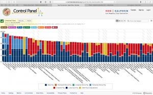