In this blog post, I actually let my roommate choose which data set I should use because I was interested to see what she would choose from such a wide range of subjects. Of course, she chose the “Death Data” data set… and I’m slightly scared of falling asleep tonight now….
For this data set, I initially tried using the Tableau Public data visualization tool, but the column that contained the states names (qualitative variables) did not even show up. So, I went back into the Excel document and added a title to the column itself in hopes of better setting up the data in Tableau… to no avail. I then tried opening up the data in the RAW website, which did not accept the data into regular code for some reason. It had changed colors even and it looked like the data was not properly being transferred over, so that obviously didn’t work. I also tried opening up Google Fusion Tables, but neither Safari nor Chrome was allowing me to open it up… there seemed to be an issue with public/private access.
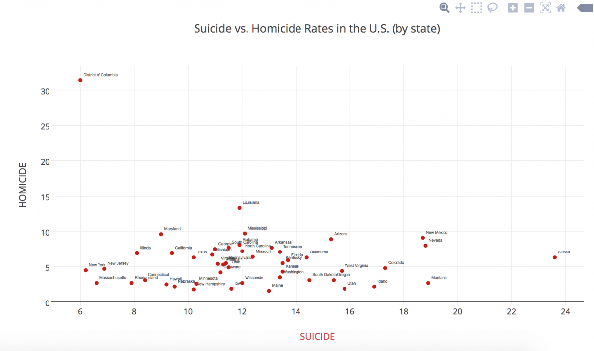
FINALLY, I tried using Plot.ly, which consumed the data set beautifully! After playing around with different types of graphs, I settled on the scatterplot, mainly because it was the best way to show multiple types of deaths at the same time, especially being able to show individual states’ differences. I then played around with shape and color, something Nathan Yau mentions in his article as pertinent.
My graph shows a simpler visual distinction of how each state overlaps in death rates, crossing homicide rates and suicide rates. It is interesting to see the outliers in a visual manner. I noticed a positive trend in my data (excluding the outliers) as a result of the visual representation.
*Unfortunately I am unable to embed the link to my data set or visualization into this post because I need to pay for an upgrade to be able to share it, since I used “pro” features. Sorry!
It is interesting to know how you resourcefully managed to complete the homework. Nowadays we have so many options for the visualization but it is difficult to chose the correct one for beginners because sometimes we really don’t know what we are really up to. Your visualization offers a great perspective to see the relationship between the two types of deaths. I also hope to learn your insights of your analysis of the chart. For example, why are there more suicides than homicides in some states?
Anna, thank you for sticking with it! I know it can be so frustrating when your data doesn’t behave properly. But I’m so glad you kept at it, and the visualization is actually really interesting. I think the scatterplot is a good choice for this kind of data.
I believe that your visual display of data represented your dataset in an organized fashion. Your summary of the dataset helped me understand what was being shown by the visualization, and, after reading it, it became even more clear. However, I wish that you would have described the dataset in general in more detail. I thought hearing your thought process was an interesting aspect of your post, but I would have like to see more data analysis instead.
I like the visual you chose for your data, it makes it easy to compare the homicide and suicide rates to the state very quickly and effectively. I had similar issues with the data input, but didn’t think about adding an extra row, that was very creative. Good luck with your roommate 😉