This week, I decided to create data visualizations for the data set “DeathData.” Perhaps it was the girl in me that loves CSI and Dateline that drew me to this dataset, or maybe just simply an innate morbidity. Either way, I was fascinated by the many causes of death listed and what it would say about the states and DC, and I knew that data visualization would be the best way to pull those narratives out of the numbers.
Because this data is listed in categories, I knew the best method of presentation for the data would be by bar chart, which, luckily, most data visualization tools can be used for. I started with Tableau, which allowed me to make a bar chart rather easily, but I was surprised when it made my state’s bars different colors. As Nathan Yau tells us, color is very important. The color hue provides context, so if it is darker, our minds assume one thing, and if lighter, we assume the opposite. I knew I wanted my data visualization to present the same data in the same darker color, so as to make it clear that we are only talking about one form of death and that the states are directly comparable. Instead, I chose to use Google Fusion Tables, which allowed me to easily create my bar charts and directly compare causes of death with each other and the total death rate.
The first bar chart I made was in relation to homicide, which, as I said, was likely because I have always loved crime shows.
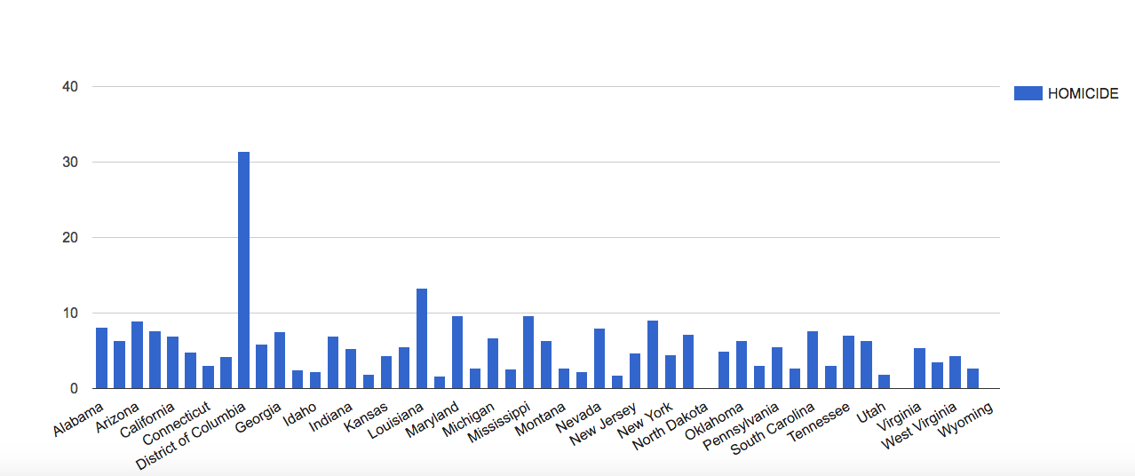
Now, as you can see, there is one major outlier in the data, and that outlier is the District of Columbia, our nation’s capital. This tells us that in DC, more than any other part of the US, there is a higher rate of homicide. This could be because DC is a city, and cities tend to have a concentrated amount of crime, but there could be other factors at play that would require more research. All I know is that my first assumption is that Frank Underwood has been up to something.
In order to look at this data in context, I compared the homicide rates to the total death rates.
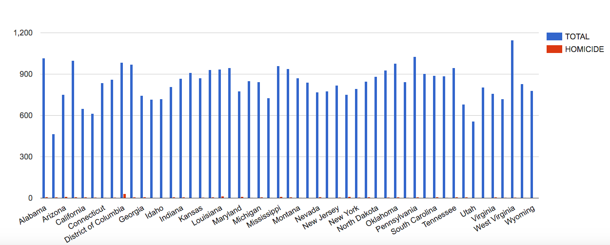
As you can see, homicide is not a major cause of death generally, but it is still a noticeable cause of death for DC. This context is important, because if someone solely looked at the homicide death rates, as happens with the news, they might’ve assumed that homicide is a more major problem in America, and they would’ve never wanted to visit our nation’s capital.
It is important, when dealing with data visualizations, to not only look at one small aspect of the data and be done with it, but to also attempt to answer questions or concerns with the data through further visualization. One data visualization doesn’t always tell the full story, but it does raise important questions about the status of what you’re analyzing and it offers new questions and narratives to be pulled from the data.
Fascinating blog post! I loved how you included 2 graphs. It really exemplifies the idea that visualizations can be very misleading. If I had only seen your first graph, I would assume that homicide is a huge aspect of deaths and I would be a lot more fearful of getting killed by a homicide. Your second graph showed a totally different viewpoint, which is that homicide is actually an extremely small portion of deaths. This really shows us how DataViz can be used for malicious purposes, such as to exaggerate something or hide something else.
Really interesting, Jenny! I agree with Anna, the two different visualizations are really helpful. One thing I’d suggest for this visualization is to label your axes. I wasn’t sure if the bars were indicating pure numbers of deaths, or deaths per capita, or what. (Of course, if it’s pure numbers, then DC is even more of an outlier!)
Really interesting post, I particularly enjoyed your own personal anecdotes. It was really interesting to see the homicide data, but putting that data in perspective to total death rates was more telling. The initial shock associated with the number of homicides was lessened when I saw that homicide was not a large portion of cause of death (as it should be).