Some Other Katherine

Follow the link here.

For this week’s blog post, I read the short story, “Some Other Katherine,” by Sam Byers. The story is told in third person about a British thirty-year-old woman named Katherine who maintains casual relationships with men and expects very little in return.  Her main male companion is Keith, who has outside relationships, but only ever mentions Janice, a blond he went to Tenerife with, leading to Katherine’s jealousy.  The network graph, in not allowing color, is frustrating in this case.  Though Keith is a prominent character throughout the story, we can’t denote that because he has merely two connections, one to Katherine and one to Janice. It puts him on par with the stripper, Clover, whom Katherine interacted with once, or Brian, whom Katherine only slept with for a short time and is hardly mentioned in comparison to Keith.

Debbie, Carol, Dawn, and Jules are all coworkers of Katherine’s, as are Keith, Brian, and Mike.  While the ladies are all connected as a work friendship, Katherine has slept with all of the men, but Mike had a problem with her relationship with Brian and was unaware of her relations with Keith, hence no relationship between them. Because many of them were not directly stated as being aware of each other or having relations, I did not mark a connection.


Analyzing Digital Harlem

In the Digital Harlem project, just under its title at the top, it reads “Everyday Life 1915-1930.”  However, I argue, the map project doesn’t necessarily achieve this goal of presenting the everyday life of those who lived in Harlem during this time period, and, rather, skews the views of its viewers as to what that daily life would look like.

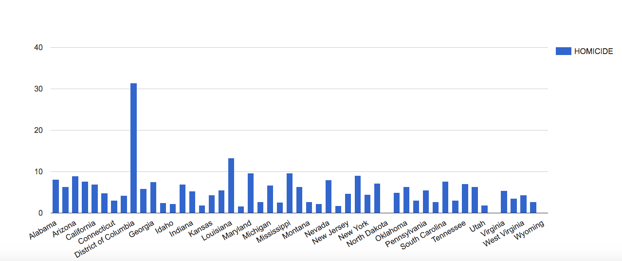
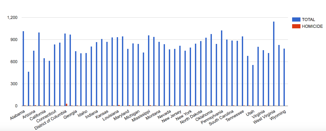
In the “Welcome” box, a description of the project reads that it gathered its data from legal records, newspapers, and other archived and published sources and it says from that we can draw conclusions about Harlem’s every day life.  When someone looks at legal records, they are solely looking at crimes that happened, rather than simply everything going on in Harlem.  From my previous blog post, I discussed how looking only at a homicide data visualization would make a person assume that homicide is a major cause of death in America.  The same goes here for crime.  If we look at crime and legal records as a descriptor of the Harlem community, that would cause us to assume crime is a major factor in their everyday lives, even though there is a high chance that is not true.

Furthermore, in using newspaper clippings, there is a lack of “everyday” realism to this project.  Newspaper clippings are written about noteworthy pieces of information that the people living everyday lives would want to know.  Often, in newspapers, individuals aren’t learning about the everyday things.  They wouldn’t read that Jimmy ate a bowl of cereal for breakfast, because that isn’t news-worthy.  Rather, they learn about such and such crime or scandal, or even the major accomplishments of the community, neither of which fall in the realm of everyday life.

Then, should you choose the Numbers Arrests map option on the right, a slew of dots will pop up, and if you click some of them, you will find that many cases shown were dismissed.  In looking at cases that were dismissed, we get a further skewed view about the amount of crime in the area, thus further skewing our idea of what conflicts arise in Harlem’s “everyday life.”  If you look at the top, you can mark black settlement in the area to layer with the number arrests, which seems to make a mental connection between black settlement and crime in Harlem, which may not be a fair image to create for the everyday lives of the people of Harlem.

Then, if you go to January 1925, the description itself says it left out recurrent events, which is at the core of what “everyday life” is, it is a series of recurrent events.  It seems almost ridiculous that recurrent events like church services would be left out, because church is clearly an important part of these individuals’ lives.  The fact that they selected to leave out key sets of data further emphasizes the sense of agenda laced into this map.  Instead of the daily activities, we get who was murdered where, who robbed who, and who was arrested for prostitution with the occasional alumni club meeting thrown in.  This isn’t the everyday life.

For the site, in its About, to say it is about “the lives of ordinary African New Yorkers” is simply preposterous and, to be honest, angering.  Rather, they try to argue that out of the “suffering” these Harlemites are facing, they turn to crime, but that narrative is lost.  We learn nothing of the daily life, the family life, the work life, of these individuals.  Had this map incorporated family photos, personal narratives, films, and other information about this area, I might’ve found it to be more true to these Harlemites’ daily lives.


Homicide in America – Blog Post

This week, I decided to create data visualizations for the data set “DeathData.” Perhaps it was the girl in me that loves CSI and Dateline that drew me to this dataset, or maybe just simply an innate morbidity.  Either way, I was fascinated by the many causes of death listed and what it would say about the states and DC, and I knew that data visualization would be the best way to pull those narratives out of the numbers.

Because this data is listed in categories, I knew the best method of presentation for the data would be by bar chart, which, luckily, most data visualization tools can be used for.  I started with Tableau, which allowed me to make a bar chart rather easily, but I was surprised when it made my state’s bars different colors.  As Nathan Yau tells us, color is very important.  The color hue provides context, so if it is darker, our minds assume one thing, and if lighter, we assume the opposite.  I knew I wanted my data visualization to present the same data in the same darker color, so as to make it clear that we are only talking about one form of death and that the states are directly comparable.  Instead, I chose to use Google Fusion Tables, which allowed me to easily create my bar charts and directly compare causes of death with each other and the total death rate.

The first bar chart I made was in relation to homicide, which, as I said, was likely because I have always loved crime shows.

screen-shot-2016-10-24-at-11-29-41-am

Now, as you can see, there is one major outlier in the data, and that outlier is the District of Columbia, our nation’s capital.  This tells us that in DC, more than any other part of the US, there is a higher rate of homicide.  This could be because DC is a city, and cities tend to have a concentrated amount of crime, but there could be other factors at play that would require more research.  All I know is that my first assumption is that Frank Underwood has been up to something.

In order to look at this data in context, I compared the homicide rates to the total death rates.

screen-shot-2016-10-24-at-11-40-34-am

As you can see, homicide is not a major cause of death generally, but it is still a noticeable cause of death for DC.  This context is important, because if someone solely looked at the homicide death rates, as happens with the news, they might’ve assumed that homicide is a more major problem in America, and they would’ve never wanted to visit our nation’s capital.

It is important, when dealing with data visualizations, to not only look at one small aspect of the data and be done with it, but to also attempt to answer questions or concerns with the data through further visualization.  One data visualization doesn’t always tell the full story, but it does raise important questions about the status of what you’re analyzing and it offers new questions and narratives to be pulled from the data.


Week Three: Payroll By Departments Ontology Analysis

For this week’s blog post, I decided to analyze the ontology of the Payroll by Departments data on the LA City Controller website.  This dataset includes information about the fiscal year, position being paid, the job class title, employment type (full-time or part-time), hourly rate, projected annual salary, each quarter’s payments, base pay, total pay, benefits payments, and more.  A record in this dataset is each of the 33 data types defined for each row.

According to Wallack and Srinivasan, an ontology is “a system of categories and their interrelations by which groups order and manage information about the people, places, things, and events around them.”  I would describe this dataset as being a state data system, with a state-focused ontology.  Though this is from the city controller’s office, Wallack and Srinivasan described that state data systems offer the infrastructure of administration, and in this case, the payroll is at the core of the city’s functionality.

This dataset is clearly published as a way to establish transparency between the city and its residents, so the residents can know how much money goes to each position and can see what the financial priorities of the city are.  When someone clicks on, say, the Elected Officials data, that resident would know how much individual City Council Members are making off of their elected positions.  To further lend itself to transparency, some of the categories are even defined at the top so people know what the data means.

However, this data appears to be left intentionally vague.  For instance, we know that we are looking at a Council Member’s data, but we don’t know which Council Member we are specifically looking at, so if there was an issue in the data, like maybe one Council Member accepted a huge bonus, we wouldn’t know how to hold that one person accountable.  There is also an information overload in this dataset.  There are so many columns of information, it would overwhelm a resident looking for information.

Another issue with the presentation of this data is in its visualizations.  When you open the dataset, its first visualization is a pie chart of each department and how large its percentage of the overall city payroll is.  It only tells you the amount of money paid in payroll to that department, but gives no context as to the makeup of that department.  A resident would have to delve into the depths of the data to understand that, which is time consuming, overwhelming, and unnecessary.  Perhaps if more information had been put into the data visualizations, they would have been more useful.  What is clear in them, however, is what the city wants to project as its departments of priority.  A city resident could look at the data and be pleased that the city values keeping its citizens safe and healthy, with police, water and power, and fire earning the most payroll.  While these are major categories earning a lot of money, there is also departments like “Harbor,” but the visualization offers no explanation about the department, what it does, or who is being paid the over 97 million dollars listed.

If this were coming from the residents of the city, the information would look a bit different.  The main focus might be on positions of power, how much they are making in total, how much work they are actually putting in, and how this relates to other cities and the overall city budget.  I would be wondering how much of my city funds are going to these individual positions, especially with the public positions earning in the top 1% of the country.  I would want to be answering questions regarding why and how my money is going there and its effectiveness rather than simple numbers about what percentage over base salary it is.

Week 2 – The Finding Aid for “Collection of Material about Japanese American Internment”

For this week’s blog post, I chose to analyze the finding aid for the archive of materials from the American Japanese interment camps during WWII. Located in the Special Collections of UCLA’s Young Research Library, this collection contains four boxes and a map folder of information.

Off the bat, there is something very intriguing to me about naming the archive of Japanese internment materials “Collection of material about Japanese relocation,” which can be found under the label Title, and differs from the title at the top.  This idea of relocation is also seen in the War Relocation Authority, the government organization that headed the Japanese internment camp system and wrote many of the publications and press releases in the archive. In using the term relocation, rather than internment, it can be assumed that there might be governmental bias within the collection’s contents.  This is problematic, given that entirely honest narratives aren’t often given by the government.

The contents of the archive include press releases, newsletters, school yearbooks, speeches, pamphlets, etc. Two boxes, or half, of the archive come directly from the War Relocation Authority, which I assume is due to the controls on communication and message dispersal placed on internees.  Even the yearbooks and newsletters would have likely needed approval by the War Relocation Authority.  Many of the documents mention what the experience of living in the camps was like, which could help build narratives around that. Surprisingly, according to summaries in the finding aid, the documents also contain information regarding resistance against the camps and prejudice experienced by Japanese Americans, which could deepen these narratives in ways I hadn’t expected.

The data in this archive, while detailed, may not give a full picture of the reality of the time.  For example, Box 2, Folder 11 contains articles from multiple newspapers regarding the bravery of Japanese American soldiers during WWII. Because newspapers are focused on readership, this could be a signal of positive attitudes towards Japanese Americans, so perhaps these articles wouldn’t have offended America. However, on the other side, the newspapers felt a need to publish these articles that would boost the image of Japanese Americans and their loyalty, which could also identify negative attitudes toward Japanese Americans, attitudes that newspapers might have wanted to alter. It is clear that this data, while detailed, doesn’t provide all the information necessary for the narrative of Japanese Americans during WWII. It’s important to gather data from multiple sources, especially outside of the government, to get a more complete idea. Though there is a lot of information about the logistics of camp operation, we don’t yet have a full idea of American sentiment towards these relocated individuals and what the Japanese American families were really grappling with.

In order to get a more complete narrative about what life was like in the camps, it’s best to go to those who lived it. Information gathered from interviews or the like could be useful for an unbiased and honest narrative. With each family having its own unique experience, incorporating each of these into the broader narrative of the Japanese internment camps is necessary.

Reverse Engineering Photogrammer – Blog 1

For this week’s blog post, I decided to reverse engineer Photogrammar, which organizes and presents the Library of Congress’s 170,000 photographs taken from 1935-1945 for the US Farm Security Administration and Office of War Information (FSA-OWI). In order to reverse engineer this project, I will describe the sources, processes, and presentation choices utilized by the Yale research team.

The sources used by the research team were the FSA-OWI File photos held by the Library of Congress. The researchers also utilized the organization system conjured by Paul Vanderbilt, who was part of the FSA-OWI. In order to get these photos into digital form for processing, researchers scanned the images, organized them digitally by county and photographer, and built charts based off the information in the archives. Unlike other projects we’ve looked at, Photogrammar doesn’t appear to have much photo analysis, but rather presents the material in a digital format that makes the material easier for users to interact with.

Upon entry to the site, the home page offers basic information about the project with a large blue “Start Exploring” button that beckons users to enter the site. By using the term exploring, the research appears more approachable for experienced researchers and casual Internet users alike. From this homepage, the site then goes to a map of the United States divided into counties, with those shaded in darker greens indicating more pictures from the collection taken in that county. This map was presented using the programs Leaflet and CartoDB. Users may control what time period of photos they look at through the timeline in the upper corner, which is useful for users looking for photos of a specific era, such as pre-WWII or the Great Depression.

screen-shot-2016-10-03-at-12-35-23-pm


For users with specific research goals, the Search tab and Treemap options are useful tools. The Search tab allows users to find their information by classifications such as Lot Number and Classification Tags, while the Treemap organizes the photos by Paul Vanderbilt’s 1942 organizational system. For casual internet users, these tools are easy to use, but not necessarily as easy to interact with as the maps.

screen-shot-2016-10-02-at-9-57-09-pm

For someone with little digital humanities experience, like myself, the most interesting feature to the site is the Dots map. There you can see where each photographer took his or her pictures. This is particularly compelling for understanding the whereabouts and behaviors of the photographers themselves. For instance, with Jack Delano, his dots mark a clear path he took in March 1943 from southern California to Illinois. On this map, you can see the areas and regions that most inspired these photographers, which leaves room for further research. Then, on the Metadata page under the Labs tab, you can analyze photos from California on multiple plains of information, which shows compelling relationships between the photographers, the geographic locations, and the photo content.

Overall, I greatly enjoyed interacting with this research. It was easy to navigate and explore while packed with information and possible research direction.