The project I chose is Inventing Abstraction, a digital project with a goal of documenting the beginning of abstraction across artistic disciplines as well as illustrating the connections between artists that allowed the movement to thrive and spread quickly.
To begin with, the main source of information that this project uses is the MOMA exhibit Inventing Abstraction. This exhibit was shown from December 23, 2012 to April 15, 2013 and contains abstract art of various mediums, including paintings, photography, music, and film, from various artists from the years 1910 to 1915. Additional information about the individual artists and about each specific work of art is sourced from various curatorial assistants at MOMA.
In terms of processing, the first way the exhibit was processed was by taking pictures of all of the works that could be photographed and adding videos of other pieces (clips of dances, films, etc.). In addition to the images and videos documenting the physical pieces shown during the exhibition, the digital project delves farther, by also processing information about the artists themselves. The artists were processed by recording connections that artists had to one another. The project defines a connection as “individuals whose acquaintance with one another during these years could be documented”. This is a way of organizing the artists; it begins to support the argument that the movement of abstraction was an effort only possible through collaboration and these connections between like-minded individuals. Additional information about the individual artists and pieces was also organized alphabetically, by artist name.
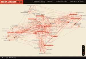
In my opinion, the most interesting aspect of this digital project is how the information is presented to the audience. Obviously, the basic presentation of this project is over the web. More specifically, all of the information is presented in separate sections. To start with, the homepage has a basic description of the project and its purpose, and then a button “Explore Connections”. Clearly this was done because the creators felt that the “Connections” section was the most important, or at least what should be visited first by the audience. The “Connections” section largely contains a network diagram, easily the most impressive aspect of the project because it presents the connections in a way that is simple and straightforward to understand. Essentially, each artist is shown as a name next to a dot with red lines connecting various dots (artists). Artists with more than 24 connections within the network are highlighted in red. When the mouse is placed over an artist’s name, the lines are bolded and appear to pop out from the rest of the network. My only critique here is that the lines should change color as they pop out, as bolded red lines over red lines are still a little hard to differentiate. When an artist’s name is clicked, the user is taken to the artist’s page; this contains photos (or videos) of all the artist’s works as well as some other facts. These artist’s pages are also accessible under the “Artists” tab, which simply lists all of the artists who have work appearing in the exhibit. Lastly, there is the “Conversations” section; this contains videos giving more information about various works of art in the exhibition. My only critique here is that the videos are presented in a long list of thumbnails, making the user scroll through everything to find what they are looking for; this could be somewhat tedious.
I was not able to find the exact software or tools used to create the website or the network diagram; however, the project credits the design studio Second Story with the design and development of the network diagram.