For this assignment, I chose to analyze Photogrammar. This is a web based platform created to help the public visualize life in the United States from 1935-1945, the time known as the Great Depression and World War II. Photogrammar consists of thousands of photographs from this time period and allows a glimpse into a very different era of the United States. This Digital Humanities project has exhibit, map, timeline, and data visualization components. It is part exhibit because it contains primary sources in the form of photographs that are categorized and made for people to encounter. It is part map because it has an interactive map showing photographs from different locations. It is part timeline because it allows users to explore photographs within specific time periods or specific years. Finally, it employs digital visualization methods through its various tools for exploring the photographic collection.
The source of the information used for this project consists of historical photographs from the largest photography project ever sponsored by the federal government. This photography project took place from 1935-1944. The project was founded after President Roosevelt created the Resettlement Administration, a relief- based government program, in 1935 in order to aid the poorest third of farmers displaced by the Great Depression. This stirred up a lot of controversy from the general public. In order to gain support for this program, the Historic Section within the Information Division of the RA set out to document America through photographs to show the public how vulnerable and unhappy some people were, and why the Resentment Administration would help many people. The project was moved to the Farm Security Administration- Office of War Information in 1937. The FSA-OWI produced many iconic photographs and included many famous photographers. The negatives were sent back to Washington DC and became known as the FSA-OWI File. The entire collection has 170,000 photographs from 1935 all the way up to 1946.
The processing of the photographs involved digitizing them in order to be fed into a computer and made computationally operable. They were digitized by scanning the physical photograph prints into a computer.
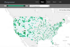
The project is presented in a two different ways. First, the photographs are displayed on an interactive map created by Leaflet, which is a JavaScript library for interactive maps. CARTO is also used with attribution. The interactive map has the option to allow users to view the map by “Counties” or by “Dots.”
The “counties” option breaks apart the photographs by which county they were taken in. Each county is presented in a varying shade of green. There is a timeline at the top of the map which allows the user to choose which year(s) of the photographs the user wants to explore. There is a window allowing the user to choose which photographers’ photos to explore.
The “dots” option breaks apart the photographs by the photographer who took them by including a color coordinated key. This option also has the same timeline and photographer pop up option as the counties option.
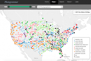
Both the Counties and Dots maps also have the ability to show the 1937 Vico Motor Oil Map alongside the photographs.
When the user clicks on the county or the dot, he/she is taken to a page with all the photographs corresponding to the location or photographer they choose to see. From this page, the user can click on a specific photograph and find an enlarged version, a caption, a photographer, the date taken, the specific location, the classification, lot number, and call number, as well as similar photos.
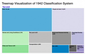
The second way that the project is presented is through the use of three different Photogrammar Labs. These are extra tools for exploring and interpreting the huge photographic collection. One of the labs is called Treemap created by Paul Vanderbilt in 1942. It is a 3-tier classification system that begins with 12 main subject headings, 1300 sub- headings, and then sub- sub headings. This allows users to explore the photographs based on the content of each photograph instead of the location or photographer.
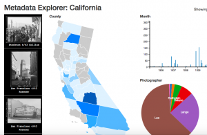
The second lab is called Metadata Dashboard and allows the user to discover the relationship between date, county, photographer, and subject in photographs from individual states. This dashboard is still in development and only California is available to view. This is really cool to explore because you can click on multiple counties within California to view the data together, or explore only one county at a time.
The third lab is called ColorSpace and allows the view to explore the color photographs based on hue, saturation, and lightness. This feature is not developed yet and is coming soon.