
Introduction
For the blog post this week, I reverse engineered Photogrammer, which is a website that presents photos during World War 2 and the Great Depression. The website contains 170,000 photos from this era from 1935 – 1945, taken by the Farm Security Administration – Office of War Information (FSA-OWI). Photogrammer contain photos that depicts the harsh lifestyle that many Americans had to face during this devastating time, and is presented in an easy manner in which users can easily click, for example, on a map, to see photos during that period of time.
Sources
The photos used in the website were taken by the FSA-OWI from 1935-1945 to capture the lifestyle before and after the relieve services which were passed to get America out of the Great Depression. These relieve services were appointed by President Roosevelt, with the first major initiatives being passed in 1935, called the Resettlement Administration. Thus, by taking photos starting from 1935 where the Great Depression was still shattering the US economy, the photos were meant to be historical evidence that delineated the woe of the people during the depression, and eventually the success of these initiatives.
Processes
Photographers were sent all over the country to take pictures of the lifestyle, and sent to Washington DC, where the photos became known as the FSA-OWI File. Furthermore, more photos from other collection were added, to total 170,000 photos. Photogrammer then scanned these photos to digitize them, and were uploaded on their website, allowing people from all over the world to view the collection from the comfort of their own home.
Presentation
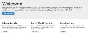
The introduction page is laid out very simply for the users to digest all the materials easily. On the top of the page, there is 5 tabs (Home, Maps, Search, About, Labs), and a corresponding information on what each of the tab is, in the middle of the home page. There is a big “Welcome!” text at the top, with a smaller text underneath that briefly explains the website, and a blue button that stands out that reads “Start Exploring,” making it obvious for users to find the starting point.
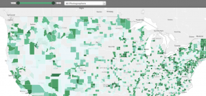
The main method that the website presented the website is through an interactive map, in which the users could click the approx. location on the map to see photos from that location during 1935-1945. Furthermore, there is a slider on the top of the map to allow users to choose any interval of time between 1935-1945. This is useful because users can choose to see photos, for instance, of 1935-1937 and compare it with 1943-1945 to see the difference in the standard of living.
Another option the user can adjust is where they want to see the photos by county or dot. The county option highlights photos of counties by a hue of green color, with darker color symbolizing a greater concentration of photo per area. On the other hand, the user can also choose the dot option, where different colored dots placed all over the map, each color representing a different photographer. Once the user clicks on a photo, the user can easily see all the photos from that location in a grid format, and by clicking a photo, the user receives a bigger picture of the photo with more information on the left of the photo with captions, name of photographer, date, location and more.
I thought this was an informative post. You very methodically broke down Photogrammar into the components of sources, processes, and presentations. I felt that you were descriptive and clear throughout. The project was fully conveyed, and I fully understood it through the post alone. While it was great reading about the project itself, I think it would be cool to hear some of your insights on the project. Did you like it or dislike it? Did you think it could have been improved in any way?