
 In my last post, I explained how you can visualize a network of film personnel (really, any kind of network) using Cytoscape. When I left off, we’d created a network visualization, but it didn’t look exactly terrific. Here’s how you can customize the look of your network visualization so that you can see what you need to see.
Let’s assume you’re starting with the default network view.
Switch to the VizMapper pane
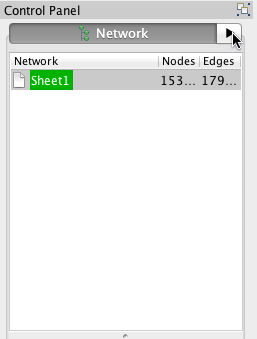
Click on the right-facing arrow next to the word Network to bring it up.
Click on the source-target diagram
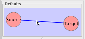
This will bring up the appearance pane.
Start playing with properties

Start by clicking on Node_Fill_Color. As you’ll see, you can customize lots of aspects of your diagram. By clicking to the Edge and Global panes, you can also change many characteristics of edges and overall colors.
Looks pretty good!

Much easier to see! But at a glance, it’s hard to distinguish films from people. Let’s look at ways we can distinguish among the kinds of data we have.
Create a node attributes file

Unfortunately, this is a little harder than it should be in Cytoscape.You have to create something called a node attribute file in order to tell Cytoscape to divide your nodes into two types: source nodes and target nodes.
So head back to your original network spreadsheet and save it as something new. Delete your middle column — the one that has all the relationships in it. Then cut the entire contents of column B — the one with the film titles in it — and paste them into column A, below the names. The idea is to have one long column. Finally, in column B, type the word source for every person and target for every film. Label column A node_id and column B node_type.
You’re welcome to use my spreadsheet as an example.
Import your node attributes
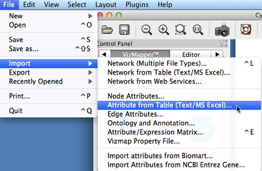
Go to File, Import, and then Attribute from Table (Text/MS Excel)… Select your file and click Import.
Change the settings for individual attributes
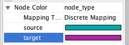
In the list of attributes under the words Visual Mapping Browser, click on Node Color. In the column on the right of Node Color, hoose node_type. Then, for Mapping Type, choose Discrete Mapping. Now you can specify different colors for the source nodes (the actors) and the target nodes (the films) by clicking on the ellipses (…) button.
Repeat until you’re happy!
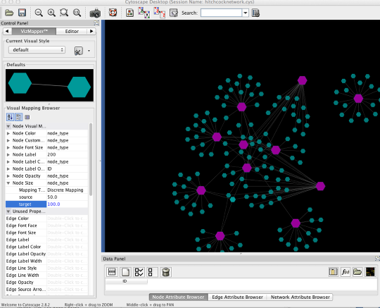
You can repeat this process for lots of different variables, like Node Opacity and Node Size (use numbers for each of these values). Play around and see what you like! There’s no right way for your visualization to look. The idea is to explore your data and then present its interesting features as legibly as you can.
4 responses to “Customize your network visualization”
[…] Projects ← My Ada Customize your network visualization → […]
Hey Miriam, this helped me a lot!
I’m just getting to know Cytoscape and I should visualize a social network, but it’s hard to find instructions that are easy enough! 🙂
I still had some complications. For example some of the targets and sources were left unpainted (no matter how many times I tried to do it, heh)! Do you know how to avoid this?
Also I still don’t know for example how to add more contacts to existing network (except manually).
But thank you for this! 🙂
[…] A how-to for Cytoscape – Miriam Posner’s blog on this […]
[…] Miriam Posner’s lessons on Cytoscape and customizing your network were useful for crafting this […]