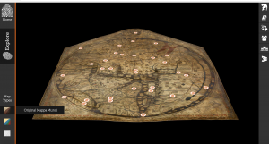
The Mappa Mundi website is an interactive way to learn more about how the world was seen as in the year 1300 in Christian Europe. The site let’s you explore the map that has been preserved by the Hereford Cathedral, where the map is located. The map showcases the inhabited part of the world at that time, which was Europe, Asia and North Africa with religious and mythological influences interplaying with the map. The site includes links to other aspects influencing the map, such as myths and legends, bible stories, beasts of the world, strange peoples of the world, towns and cities, and a 3-D scan of the map. The map has focal points which you can click on to take a closer look at the illustrations and learn more about the back story.
SOURCES:
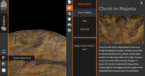
The ultimate source of the project is the map itself. The illustrations of historical landmarks and biblical references are intertwined, creating a narrative of what the beliefs were of the people in the late 13th century- early 14th century. For example, the image of “Christ in Majesty” shows how Christ is above everyone in the world, with people to his left being directed to hell, and to his right, people with passageway to heaven. Myths and legends have great influence on the map as well, with mythical animals being included in certain regions, and “strange people” and what they look like and do being illustrated in the map as well.
PROCESSING:
The map is available in its original format, a color enhanced format, and also available in a 3-D scanned format. The color enhanced format helps with visualization of bodies of water, the Red Sea, and of grass lands. The 3-D scanned format also informs the viewer more about what the map was drawn on (vellum), how its that was made, and how it has been repaired throughout the years and overall showing how the map has been maintained. The site also includes links that help navigate the map more efficiently, with Titles like “Myths and Legends”, “Bible stories”, “Beasts of the world”, “Strange peoples of the world”, and “Towns and Cities”. These then include subcategories that give you more insight to particular focal points of the map.
PRESENTATION:
The fingerprints scattered around the map make it easily manageable to get the most out of the map. It makes it more interactive and easy to learn as much as possible. Other sources are also included to learn more about life of the late 13th century and of Hereford. Although not everything of the map is highlighted, it gives a glimpse of what would be in store if one was to visit the medieval map.
Hello,
I liked the introduction, it really gives a clear picture of Mappa Mundi’s significance. One thing that I had trouble understanding is the difference between processing and presentation. Perhaps, for example, for 3D presentation, the processing would be the scanning itself?
Hey,
Its truly incredible to be able to dig into this preserved treasure of a map. It gives us an idea of the way of thinking during this time. Did people truly believe the world was set up this way? Shows you how far we’ve come as humanity. Great post with plenty of insight into the page.
The reverse-engineering of this digital humanities project is accurate in the breakdown of the usability and navigation of the materials. I agree that the finger-prints make the map much easier to understand and follow. Also, the historical and traditional mythology of the source do account for a majority of the source content which would have lended to more of a compilation of the sources, like suggested in the post.