The Shape of History: Reimagining Elizabeth Palmer Peabody’s Historical Visualization Work is a unique piece of data visualization that tries to challenge viewers to a more complex and full data visualization compared to the traditional New York Times or the Economist data visualizations. Elizabeth Palmer Peabody, a 19th century writer, editor, and educator, transformed data into a grid chart that utilizes an interactive historical map with the aim to allow viewers to interpret the visualization for themselves. Palmer’s chart organizes historical data in a narrative format that demonstrates a progression of events and the events’ relationships with each other. The creators of the site, wanted to revitalize Palmer’s work in a digital format to allow for interactivity for the viewer.
Sources
The “Site Information” section lists the credits and sources of this project. They list the American Antiquarian Society and the Library Company of Philadelphia as the primary sources for performing research on Elizabeth Palmer’s work. All other sources came from open source libraries from different online databases and the project using HTML5, CSS, and Javascript.
Processing
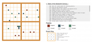
Processing data for digital humanities is extremely important because it can have big implications as to how the data can be used. Under “Explore,” historical events are organized into an interactive chart which indicates that historical events must have been categorized by time, location, and event type. Additionally, the “Play” page enhances the depth of information by allowing users to toggle with the data themselves and organize it themselves. This demonstrates that information was carefully curated for each event for the user to be able to interact with it at that level. While the original data set remained largely intact, it is clear that for the final online product it had to be edited, enhanced, and reworked to allow for online interactivity.
Presentation:
Data presentation is a tricky business. Done right, it can reveal a lot of information that otherwise was hard to tell. Done poorly, it can hide a lot of implicit biases of the data presenter. In this project, the data is visualized in a grid format – different squares within the grid representing various events. The information is accessible and intuitive, with tutorials and instructions on nearly every page. The interactive interface allows the user to navigate the site easily and allows for a self-guided lesson on history almost like a museum. The site’s dashboard organizes the different pages in clear sections and also functions as a navigation to the site.
I analyzed “The Shape of History” as well and I agree with what you said. You mention that presentation if done poorly can make it more difficult to get information out of the project which would be the opposite goal of digital humanities. I believe that this specific project does a great job providing us with all the information we’re looking for or the tools we need to find them. I like the way you analyze the processing part of the project and the way you explain how it was specifically meant to be very interactive. I think Elizabeth Palmer Peabody had a lot of data and a difficult project to put together and visualize, but it was very well organized and now it is comprehensible and accessible to everyone on the internet.
Hi Daniel! Great blog post! I like how you included thorough explanations and divided your post into clear paragraphs focusing on the sources, processing, and presentation. Like you mentioned, data presentation is a tricky business. Given that this kind of grid chart forces the site visitor to interpret the information for themselves, it is important that the creator organizes the data in a comprehensible and clear manner. I’m curious to know what your opinion is on the format of the website. Do you think this unique piece of data visualization is effective?