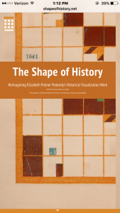
This week I chose to reverse engineer the DH project called The Shape of History: Reimagining Elizabeth Palmer Peabody’s Historical Visualization Work. This project is about how Elizabeth Palmer Peabody turned her data from a basic timeline to a different type of grid chart that kind of showed the “shape of history”. This grid chart showed events events by placing colored squares in certain boxes in the grid to show different events that different countries were involved in. A cool design of the project is that the project is in the shape of a grid. it shows you background information on how these charts came to be as well as how they are used while you navigate through the grid. It also has interactive charts that you can learn how to read and eventually fill out for yourself.
The sources that were used to put this project together were from open source libraries from different online databases. Other readings that they gathered information from were from readings on Elizabeth Palmer Peabody and her data visualization as well as readings on timelines that include sections on Peabody. The creators of the project built it upon HTML5, CSS, and Javascript.
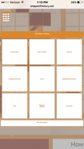
In this project, there is no single way in which you must navigate through the grid. From the top of the chart it allows you to click down and from there you can go down or right through the chart. Different boxes are more interactive than others. One box has a slide show that you click through showing how it works. Another allows you to explore through a grid chart that’s already filled out with events from 1500-1600. Other boxes testes you on your knowledge of how to fill out a grid. There is a box where it gives you the freedom to fill out a box chart will whatever you want. The final interactive box compares a grid chart to a basic timeline.
The importance of this project was to highlight the creative visualization of data that was created by Elizabeth Peabody. She was tired of boring old timelines. She created these different grid charts to help make history data have more shape and color making it more interactive for her students. It is made for viewers to learn the history of it while also being able to learn how to read and use it. This project is very easy to use and navigate through.