This short story I chose to read is called The Headless Woman by Goncalo M. Tavares. It was a really interesting story about a mom who gets her head cut off by her husband because he wanted more room in bed. The mission is for the three sons and the mom to become reunited. Her headless body runs around, leaving a trail of blood that her sons follow to navigate where she is. Although she can’t hear without a head, she can scream and yells for her sons to find her. When they do find the mom, she asks them to find her head. They run for three days and nights and on the fourth day, the three sons find their mom’s heads. However, on the way to find the mom’s head to begin with, they make the youngest son clean up the blood. Essentially they are lost and don’t how to get back to their mom. To find their headless mom again, they separate and decide to scream once they find her. When the oldest find the mom’s body, he freezes and cannot scream- for reasons unknown.
The story has 4 characters: Mom, and three sons. In the the short story, they don’t mention the children’s names and refer to them as the oldest, the youngest, and the middle one.
The network graph imaged below shows the relationship that the mom (blue node) has with her sons (orange nodes). It would be interesting if the length of the edge could be altered. This way, we can reflect how close each son is with the mom. For example, the youngest son seems like he is the closest to the mom, and it would be cool to represent that with a shorter gray line. I believe that is the limitations to creating this kind of chart. The edges in this story represent family (because each line comes from the mom and goes to the sons).
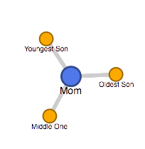
I think this kind of graph would be beneficial with a denser story- if there were more characters, the chart would have more nodes and edges. Because this story included only 4 major characters, the chart is extremely straight forward. However, this is an interesting chart to look at relationships of people, and can be used for our personal projects as we move forward.
Click here to see the graph via google fusion tables, or see the link below: https://www.google.com/fusiontables/DataSource?docid=1HAgSXYuq-ecdSX–ylYvuX5_IaK0A91aDxZFd9JQ
Wow, that seems like it was an interesting story to read! I agree that there are many limitations with this network visualization, particularly because there are not many characters. However, like you mentioned, this type of visualization would be good for other stories, and is ideal for looking at relationships between people.