Our group is looking at graphic novels. One of the research questions we are looking into is if graphic novels are more highly regarded in certain countries than others, and what the origin of the book can tell us about graphic novels in general. OpenRefine does a great job at organizing all our data into an easy to read format. For example, I downloaded our data set into the program, and if I click on:
Country of Origin (tab) → Facet → Text facet → organize by count
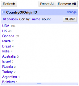
From here, we can see where the majority of books are coming from which is mainly the USA and UK (see image). This also leads me to ask our expert how the creator of this dataset chose which books to be added into this collection.
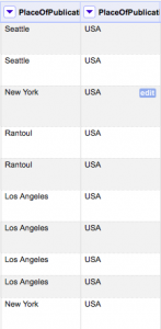
In addition, we can look at the Place of Publication tab, and separate the city from the country:
Place of Publication (tab) → Edit column → Split into several columns → Separator (; ) → Okay
Now we can easily see which graphic novels are from what country (see image).
In general, OpenRefine is a great organizing tool. It’s an awesome program for understanding large datasets because sometimes with the vast information in datasets, you can easily become discouraged. One thing I would like to know how to do is create graphs (if even possible). I tried to look at a numeric value tab and clicked:
Facet → Scatterplot fact
However, that didn’t work for me. I think I would just need to spend more time with the program to work out the kinks! Or just use other resources to create graphs- like we learned in discussion. OpenRefine seems like a pretty simple to understand program which I really appreciate.