Week 8: “Mona’s Story” Network Graph

This is the link to the network graph for “Mona’s Story” by Urvashi Butalia. The titular character, Mona, is a hijra in India. Hijra are understood as individuals who are assigned male at birth who, for some reason or another, choose to take on feminine forms of dress and behaviour. While many hijra feel that they were born the wrong gender, the term does not cleanly adhere to our understanding of transgender females. Some have described the term as a “third gender.”

The network graph illustrates connections between Mona and the various groups of people in her life that are mentioned in the story. Her family members, unnamed, constitute one group that interact with each other but not with the other groups. Chaman and Nargis are members associated with the hijra community that Mona becomes a part of, while Ayesha is her adopted daughter who is also under the care of the former two individuals. Chaman and Nargis eventually cut off contact between Mona and Ayesha for most of the girl’s childhood. Chand, Ankit, Dharmendra and Jugnu are described as “young men transitioning (if one can use that word) from maleness to femaleness,” who come to Mona for advice.

The three groups depicted in the graph do not have connections with one another, only within themselves, but all of them are closely connected with Mona. The graph thus illustrates how the various parts of Mona’s life are sectioned off from one another. However, the graph is unable to illustrate the nature of these relationships, nor depict a timeline in which these relationships take place. The latter would have been helpful for this story since Mona’s significant interactions with these individuals took place at different times of her life.

Week 4: Post-WWII Elections Data

For today’s blog post, I decided to examine the voting data for presidential elections post-WII.

My first visualization lays out the number of votes for the Democratic and Republican candidate, as well as the total number of votes.

Number of votes per year

This allows us to see the trend in number of voters overall and for each party, as well as see which years the Democrats and Republicans won respectively.

My second visualization focuses on the vote difference between the winning and losing party.

Vote difference by winning party

The bars are highlighted with the party color of the winning party that year. Darker colors indicate that the party was the incumbent party. This visualization allows us to see that Republicans tend to win by higher margins than Democrats. Republicans also tend to win more when they are the incumbent party.

Week 3: Funds Relating to Housing and Homelessness

This week, I will be examining the dataset titled Funds Relating to Housing and Homelessness. The dataset consists of all the funds in the Balance of City Funds that relate to housing and/or homelessness. It provides us with various kinds of information associated with each fund, such as the name, cash amount, source, associated department and contact person. An individual record in this dataset consists of one fund, with other informational categories attached.

The ontology of this dataset, defined by Wallack and Srinivasan as a system of categories and their interrelations by which groups order and manage information about the people, places, things and events around them, is one rooted in an administrative viewpoint of the various funds listed in the dataset. This is evident through the kinds of information that are being collected: information such as the purpose, cash amounts, and whether the fund is within budget will best help administrators to determine how they should allocate funds in the future. These could be current or future administrators, or they could be officials in other cities looking to implement similar programs. Such information could be helpful in planning for similar funds.

This dataset provides me with top-down understanding of the various funds within the city budget that are targeted at housing and/or homelessness. I can see what issues these funds are aimed at, which department is planning it and who is providing the funding for it. For instance, the U.S. Dept of Housing and Urban Development provides funding for 12 of the 39 funds listed in the data set. I can also see that most of the funds fall under the Housing and Community Investment Department for LA City. I am also able to see, through the purpose field, which funds are specifically targeted to alleviate homelessness.

However, one pressing thing left out from this data is the impact that these funds have had on communities, as well as the success and failure stories in the execution of these funds. As some of them were instituted several years ago, it should be possible to discern some impact of this fund on the directly-surrounding community. Another way of looking at this, and another ontology, would be to focus on those who have benefited from these funds and how their lives have been impacted.

Week 2: Sleepy Lagoon Defense Committee Records

In 1942, José Diaz died at a party near the pond called Sleepy Lagoon. 22 men, all but one being Mexican American, were indicted for his murder. The Sleepy Lagoon Defense Committee Records, 1942-1945 collection is an archive of materials related to the effort of the Sleepy Lagoon Defense Committee to raise funds for an appeal and to publicize the case. In 1944, the decision to indict was reversed by a higher court.

The records in this collection include both official publicity materials put forth by the committee as well as internal records of the committee’s proceedings. It also includes the transcript of the initial trial and appeal trials. Looking at these records brings to mind several interrelated but separately-focused narratives that could be presented using the available data

The obvious narrative is one focused directly on the Sleepy Lagoon Defense Committee and its efforts. Financial records, minutes and internal notes give us an understanding of how the committee functioned and how it was structured. The materials collected by the committee on the Mexican American community in Los Angeles at the time give context to their mission in mounting the defense for these indicted men. Their publicity materials show us the kind of narrative that they themselves were trying to put forth. One thing missing from this narrative is a comprehensive idea of public and media perception of the committee itself. While items such as the “Zoot suiter drawing” by Manuel Delgado give us one kind of perception of the committee, we do not see many materials that report on the committee itself. Hence, to properly understand the organization and its impact we would need to also look at how the committee itself was understood by the surrounding community.

An alternative narrative could focus on the trial itself and its progress, as well as more directly on the experiences of the defendants in this case. The trial transcript provides an entire account of its proceedings, while correspondence from the defendants and their family members allow us a glimpse of how they were handling the entire case process. However, the collection does not give us a lot of information on the defendants and their lives, so we would have to look for this information elsewhere. Another concern is that the committee was not focused on resolving this case but rather absolving these men. Hence, their materials are not focused on the investigation of Diaz’s death, but on the perception and discrimination that led to the indictment of the 22 men. Materials directly relating to Jose Diaz are not included in the collection, but if we chose to build a narrative around the trial they would have to be included. Diaz’s death was never fully resolved, which a narrative of the trial would have to address.

More broadly, these records help to document the attitudes toward Mexican Americans in Los Angeles at that period and could be part of an important narrative regarding racism and discrimination. The Zoot Suit Riots of 1943 in Los Angeles were a series of racial attacks primarily aimed at Mexican Americans, and had roots in the misconceptions and fear drummed up by the Diaz case. Similar attacks occurred against Latinos in other cities across the country. This sort of narrative would require a great deal of more information, however these records would constitute a significant chapter.


Week 1: Photogrammer

Today, I will be breaking down the website Photogrammer, a project backed by Yale and the National Endowment for the Humanities. Its main focus is a collection of 170,000 photographs that document life in America from 1935-1946.

This is the home page:

homesite

Sources

The photographs are sourced from collections belonging to the Farm Security Administration and Office of War Information, the Office of Emergency Management-Office of War Information Collection and from overseas sources. Photographers were sent across the country to document communities so as to guide and provide support for government programs. The dates of the photographs range from 1935 to 1946. All of the photos organized in this website are also maintained and catalogued by the Library of Congress.

Processes

search

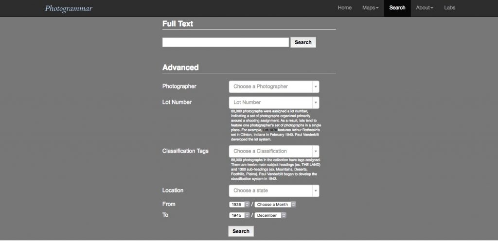
Pictured above is a search page that lists the various ways in which photos are categorized. The search variables include photographer, location, date, lot number and classification tags. The latter two are part of a classification system devised by Paul Vanderbilt for the FSA-OWI in 1942. Lots refer to sets of photographs taken by each photographer at a specific location and time. The classification tags allude to the subject matter of the photograph through 12 main headings such as “Work,” “Transportation,” and “War,” which have subheadings like “Agriculture: Crops, Livestock, Ranches,” which in turn has its own subcategories like “Cotton,” “Tobacco,” or “Wheat.”

All of this information was logged for each photo where possible (only 88,000 photos have a lot number and classification tags) to allow users to search. Another detail that doesn’t appear on this page is the call number for the photo at the Library of Congress. Since a lot of this information

Presentations

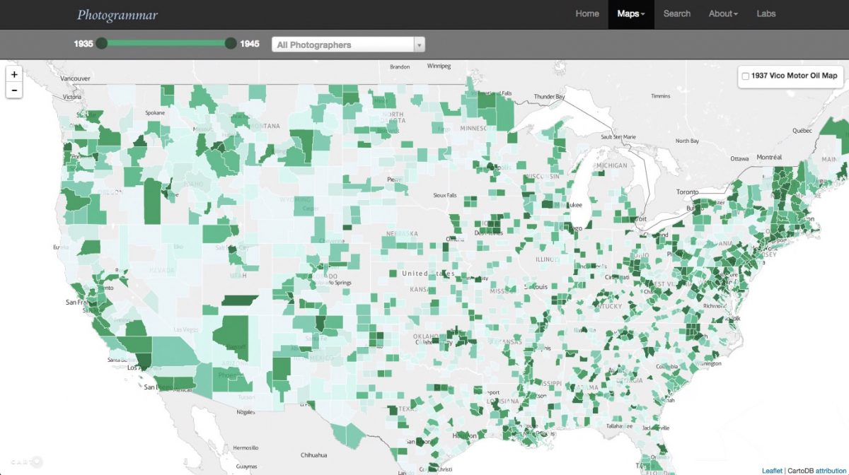
Clicking through “Start exploring” or on the “Interactive map” link on the homepage leads to this screen, which is the main visualization interface of the site:

photogrammar

The interactive map allows users to select groups of photographs to view in various geographic locations and covers the 90,000 photographs of the collection that have geographical information. Zooming out allows users to see photos taken in the state of Alaska. Another option on the map allows users to see – as dots – the sets of photographs taken by specific photographers in each location. Clicking on the links opens up a new tab into a gallery of photographs.

Clicking on a single photograph in a gallery directs the user to the page displaying the photograph in detail as well as relevant information, and similar photographs.

lange1

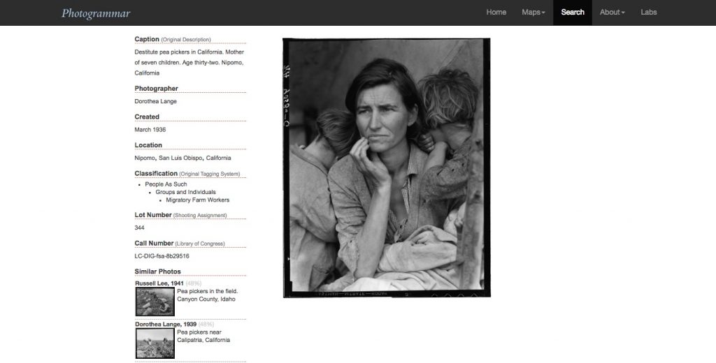
I found this famous photograph by accident as I was clicking through pages. It is one of my favourite photographs and I was pleasantly surprised to find it. As you can see, details of the photograph are presented next to it, including its call number at the Library of Congress.

Clicking on “Visualizations” from the home page to “Photogrammar labs” allows users to access various tools to visualize the data collected.

treemap

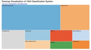
This includes a Treemap based on the Vanderbilt classification system for 88,000 photographs. Users are able to see the breakdown of how many photographs are in each category and subcategory, as well as access the photo galleries for the most specific sub-headings.

metadata

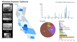
Another tool provides the metadata of photos in a specific state, although only data for California is available. Users can select one, several or all the counties where photos were taken, see the breakdown by year taken, photographer and classification heading.

One tool listed but unavailable is the ColorSpace, which is meant to categorize and summarize 17,000 color photographs based on hue, saturation and lightness.

Overall thoughts

This website had very interesting content and the designers put a lot of effort into sorting and visualizing the data for all these photographs. I felt that the classification tags could have been more clearly laid out, especially at the search page, because I wasn’t initially sure what tags were available. However, I really liked the interactive map and Treemap which helped me to gain an overview of the collection. I think this could be very useful for individuals who are looking for a specific set of photos within this collection as well as those who are curious about the collection, but found the Library of Congress’ site difficult to navigate.