I did a data visualization of “Darts,” a data set of a Wall Street Journal experiment that threw a series of darts at random and then compared the results to expert predictions of the stock market, and what the stock market actually did. The goal of the experiment was to see if expert predictions were actually any more accurate than random probability.
https://public.tableau.com/profile/laurel.scott#!/vizhome/Darts_1/Sheet1
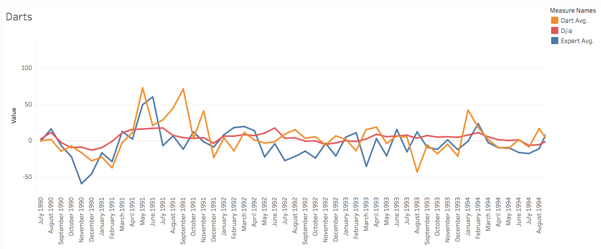
With the use of this data, it is much easier to see that neither the darts nor the expert predictions seem to have any correlation to what actually happens in the stock market. While the darts line has more random dramatic jumps here and there, oftentimes the expert opinion line will decrease dramatically at the exact same time that the actual stock market will increase. This stock market seems determined to avoid any of the dramatic increase or decreases that both the darts and the experts are constantly predicting.
It took a surprising amount of time to “clean” the data for this visualization; I had to reformat all of the “date” information into a way that Tableau would recognize it, and aggregate much of the original data into new columns displaying the average values.
Argh, so true, data-cleaning always takes so much more time than anything else! I hope OpenRefine or Excel aided you in this. The visualization you came up with is very effective — and I know you were affected by the Internet outage during your lab, so I’m doubly impressed.
I feel you! Tableau was a pain when it came to cleaning up data. Your graph looks very nice and clean though and it is very obvious that there is no correlation associated with the data. This is definitely something that wouldn’t have been obvious by just skimming through a dataset.