The map I chose to analyze this week was the Digital Gazetteer of the Song Dynasty. The maps on this website are static screenshots of the team’s research, created in Inkscape and Gimp. It documents Sinologist Hope Wright’s 1958 work that details the geographical names in Song Dynasty China. Wright’s work is also derived from another three works: “the Song History (宋史Song shi) Geography Monograph, the 980 Records of the Universal Realm in the Taiping Era (太平寰宇紀Taiping huanyu ji), and the 1085 Treatise on the Nine Territories in the Yuanfeng Reign (元豐九域志Yuanfeng jiuyu zhi).” (Taken directly from the website)
(The pictures wouldn’t load properly on my browser, they came out with this weird dark grey overlay that obscured a lot of the image and its details, and I couldn’t scroll down to read the rest of the description either.)
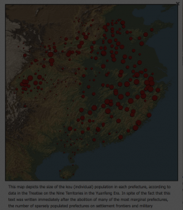
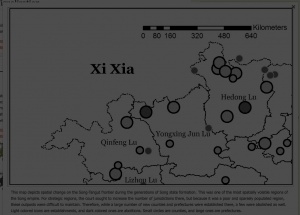
Just by looking at the map I inserted above, you see how the researchers have assumed a few things about us as viewers. Firstly, they assume we know what exactly those red dots mean and why they’re sized the way they are, as there is no legend (as there are in their other maps). While it does show how the population was distributed around the Song Dynasty, it is also confusing because unless you are familiar with that particular dynasty, the border of the country is not actually depicted. Even when they do have “county/country lines”, such as below, they are not often put in context.
Due to the nature of their research, they may be making these assumptions because it is geared toward a niche population of people studying the Song Dynasty in detail. Considering that Wright is a Sinologist, and that Ruth Mostern, the head of this digital project, specializes in Chinese history, that assumption may not be too far off.
Since the data is taken directly from Wright’s work, one can say that these maps reflect the culmination of Wright’s own research, transcribed, translated, and understood twice: initially by Wright during her analysis of the three source books, and by Mostern, who takes Wright’s book to create this project. They look at published and preserved works that reflect what was seen and recorded as a city/county/province/street etc, and so it may obscure what was deemed unimportant by government officials during the Song Dynasty. As there is no time traveling machine that would allow either one of them to go back to the Song Dynasty, they (and subsequently us) can only put their faith in these three source documents.
It would be interesting to see an interactive map, similar to the first image in style, where you could hover over the dots and see the information about the township/particular population of the region. As this also goes into the abolition of townships, it would also be cool to see why these townships were abolished.