This week I chose the Digital Harlem project to analyze the mapping techniques utilized to represent such data. This project chose to visualize everyday life in Harlem city of New York, by drawing from legal records and newspapers in the time period 1915-1930. The map is extremely interactive and consists of multiple layers that you can overlap to view to data according to your needs. The map also depicts details of that particular event when you click on it if the user wants to go more in depth.
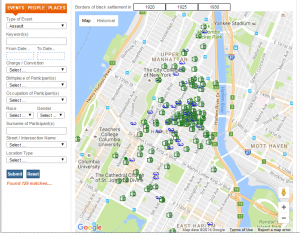
This map is definitely subjective since they used newspaper articles and records to depict “everyday life”. Since newspapers only cover significant events, the map mostly depicts events of crime or arrests that would commonly appear in the local news at that time. Additionally, this data is presented from the perspective of the police officers, who were predominantly white males which skews the data. This creates the bias of an unsafe or “bad” neighborhood that was mainly occupied by black people since most of the crimes are concentrated on one area on the map.
If I had to accurately depict everyday life, I would add more features like events happening around the area or community gatherings. I would also depict the popularity of these events or community places, by recording the number of people attending and so on. In this way the map could be used to understand how most people spent their lives during that time rather than cover events of crime.
I thoroughly enjoyed your blogpost, and the style in which you presented the information: 3 body paragraphs answering different questions, and a map to help us visualize what exactly you are trying to convey to the audience. I like your analysis that the people who created the map were predominantly white, which skews the data.
I agree with your comment about the bias in this data, an idea we have been analyzing throughout the past few weeks in class. It is so interesting how a skewed perspective can impact data interpretation so significantly. I also liked your point about including the popularity of community events. Doing this would give a more comprehensive idea of how Harlem residents spent their time during the 1930s.