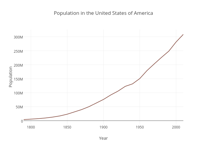
The data set I decided to explore was the U.S Population data set that shows the overall United States population from 1790-2010 in each decennial census.
The data set was very sparse, containing only two columns. One column was the year the census was obtained while the other column was the recorded population. Each record was the population of the US per a given year. Since the data was so simple, I decided to use a line graph to visually represent the trend of population growth in the United States. A line graph was the best option for this data set as it represents change in data over time (change in population as year increases). Both the variables were quantitative, continuos data which also made a line graph ideal as it shows continuos trends efficiently. The year was plotted on the x axis and the population was plotted on the y because the population is dependent on the year recorded. I used Plot.ly to create this graph as it was very straightforward and easy to embed in the post.
The important thing that the graph shows is the rapid population growth that starts after the 1800’s. While you can see the growth in population from the data set as well, the graph gives viewers a quick and more impactful perspective. The concave up shape of the graph signifies a major growth trend in a visual manner that the records do not easily convey. Not only does it show the rapid growth beginning from the 1800’s, but one can infer from the graph that the U.S population is just going to continue to grow, as the line continues to rise steadily. Further research about population growth can be done simply by looking at this graph. For example, one can look into the events that happened in the mid 1800’s that would have caused a spike in population growth (e.g the Industrial Revolution creating more resources for population growth). It is also easy to add data to the records every decennial year and continue the line chart to see if the population is still growing rapidly or leveling out. If one didn’t have the graph to look at, it would be more difficult to interpret trends from the data because it is not as straightforward and intuitive to the eye when purely looking at numbers. Graphs are highly efficient when working with and presenting large numbers because they are less strenuous to look at and catch the viewers attention faster.
Excellent job, Destiny. You really can see patterns in charts so much more quickly than by looking at a table!
The plotted graph you created is so telling, Destiny! There’s a definite upward trend. It would be interesting to see how many of the people included in the dataset were U.S. immigrants, where they immigrated from, and at what point between 1790-2010 did they move to the U.S.
You’ve created a very simple but straightforward visualization that clearly illustrates the rapid growth of the US population and other growth patterns during each time period, unlike the dataset itself. I also liked how you explained why you chose to present the data on a line graph.