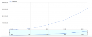
For my blog post this week, I decided to create a data visualization out of a simple data that shows the year (every 10 years) and the population at that time. The dates are from 1790-2010, meaning there are 23 different dates, and the population skyrockets from 3 million to 300 million, a 100x fold in the increase in population. However, simply looking at this table does not tell the whole story. For example, just from looking at this data that only contains 46 numbers, 23 dates and 23 population, one cannot tell if the increase from 1790 to 1890 was an exponential increase, such as 2x increase per year, or a straight line. Especially as the numbers are really exact, for example the 1790 population being 3929214, our cognition has a hard time doing the simple math on the seemingly simple numbers. It comes down to our psychology, where there are too much information coming in through our eyes, which actually creates a sort of stress and anxiety on our cognition, not allowing us to see the truth.
However, through this visualization shown above, we are clearly able to see that even simple data that only contains 46 numbers have a story to it. The data visualization shown above is a line graph, where the x axis is the years, every 50 years, from around 1790 to around 2010. The y axis is the population, 100 million people from 0 to 400 million. First, it is important to note that thanks to the style of this visualization, our cognitive load is lessened. Before, we had to deal with 46 numbers, 23 of them very cognitively demanding. Now we are only shown around a dozen numbers. The smaller graph on the right is a slider, where by moving the white vertical ovals left or right, you can see the change in number of population with respect to the year in a much closer view.

The first trend that we couldn’t deduce before from that data is the fact that from from 1790 to around 1940/1950, there is an exponential increase. By moving the slider closer, it is more obvious that the graph is exponential, the population increase is very slow at first, but once it picks up, the population increases multiple folds. The graph shown right above reveals the effect of moving the sliders on the bottom to show the years between 1800 to 1950. We can see, up until around 1940, the graph is almost a quarter-circle shape, which is one of the key features of an exponential growth. However, from 1940, we can see there is a drastic decrease in the population growth. How could this be? It is evident just by looking at the year, which is around 1940/1950, that this is due to WW2, in which the US had a deep involvement and consequently, severe casualties. Thus, the population dips and we can see that shown in the graph. This is hard to identify when looking at the data in table form, simply because the population is growing, so the population number is constantly increasing that humans cannot deduce the decrease in the amount of increase. But from this visualization, it is evident that the growth was not much. One can also tell by looking at the our first graph that the population kicks off after 1940/1950, but not necessarily in an exponential way, but in a more normalized straight growth. Therefore, our table was not simply just an exponential growth or simple straight growth all the way, but a hybrid! All of these analysis would have been impossible without the help of the visualization. It’s interesting to see that even simple data that contains only 43 number can have so much to say just by changing it from table to line-graph form!
Very nice work! What program did you use for your visualization?
Nice work! It’s good to see how a slight change in the way that data is presented makes a huge difference in determining trends or creating meaning out of that data